Dove Arline
UX - 2023 May/October  /UI - 2023 November

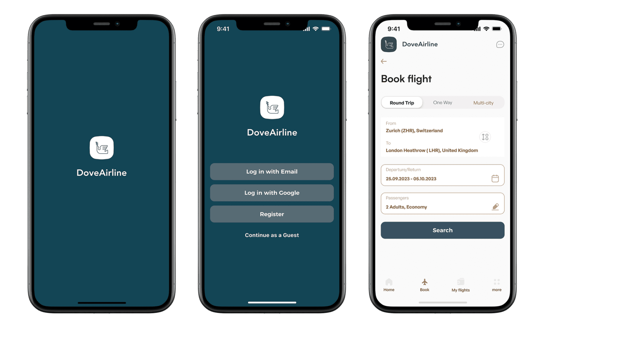
Dove Airline is a flight booking application

My Role:
User Experience designer
User interface designer
Researcher
Brand designer
Check Project in Figma
overview
challenge
wing of an aircraft
This is a UX/UI case study for a mobile flight booking app. This was part of my training in user experience and user interface design at Glasgow Caledonian University and the Dublin Institute. The case study includes the entire UX process.The process started with market and competitor research, analysis and a final prototype.

The challenge, as a user who has travelled, fortunately, quite frequently. I could see that there are quite a few airline apps where the user experience could be improved. My challenge in this project was mainly 2:
- To keep training myself as a designer and learn those aspects where I was lacking.

- To create a flight booking service where the user didn't have to think about what each element was for, that had a simple and easy interface where the only concern of the user was where he/she wanted to go.
As a solution, I would propose as a start, to create a flight booking app with easy access to information and a simple flow. For them we did a UX Resarch by stages, interviews with real users, affinity diagram, Flow diagram, journey map, and a prototype.
The UI that can be seen in this case study is temporary as it is in process and may change.
300+screens
1 creative onboarded
Airline App, threes different screens. first with the logo. Second with logo and login buttons. Third with booking screen
product process
STATISTIC
During the first 6 months I was working hard on the project and today I am proud to present you the results of the user experience research. Later the project will be updated with the interface design, which is still in process.
product stages
3 screens of the Dove Airline app, inclined
METHOLOGY
product stages
Research
Benchmarking
Survey

Competitive Analysis

I compared four airlines' app and a travel aggregator's app to see what worked and what could be improved. The screens were analysed:

- Homepage     
- Login.      
- Book / Search Flights (Single/Multi-city and One way) and passengers numbers.   
- Types of travel plans and their price (Economy, Business, Super, etc.)
- Payment  

4 competitive brands

Gain more quantitative data

I created a competitive comparison done on google form and made to several users, shared via WhatsApp, LinkedIn and Instagram. This will give me a better understanding of the objectives of potential airline customers.

- Total number of participants: 62
- Platforms where the survey was sent: LinkedIn, Instagram, Facebook, Whats
- AppTool: Google form

Survey results
personas
customer journey
To represent my research thus for, I created 3 user personas.

Hawa, a 41-year-old worker, wants to book a flight from Zurich to Valencia for herself, her husband, children (2) and dog, to visit friends and see the city.

Additional Personas:
A person who travels frequently on business.
A retired person who travels very little
product stages
flow diagram
Before designing, I wanted to make the process or flow system that details the steps necessary to complete the task of booking and purchasing a flight.
App map for the all screens
sketch
sketch of some screens
APP SCREENS
onboarding screens
COLOR
PALETTE
colours used in the app
booking flight
screens
Creating a
Booking Experience
man inside a plane looking in his bag, search screen app
booking screen process
Decorative visual screen with all screen app
conclusion
Booking app showing an example how looks the screen with a destination selected
The flight booking page had a 10% higher conversion rate. We also received fewer queries about how the platform works, which shows that the new design is easier to understand.

It was my first time managing a project on my own. Although I was nervous at first, I learned more about each field of Research, how to manage each task to meet the proposed timeline for the project, how to trust the group of mentors I had formed who guided me to come up with the best solution and that daily meetings on future projects will be critical to the success of the project.

This project validated the value of using copy that focuses on a person's primary motivation, and I look forward to applying the same approach to the rest of the site.
NEXT CASE