Dove Arline - Flight Booking App
Timeline: May–Nov 2023

Concept UX/UI case study: Designing an intuitive mobile flight-booking experience

My Role:
UX/UI Designer – Solo project
Research & Competitive Analysis
Surveys & User Interviews
Usability Testing & Note-taking
Information Architecture & Flow Design
Wireframes & Prototyping
Visual Design & UI
Basic Branding / Visual Identity
Check Figma
overview
/
challenge
wing of an aircraft
Problem StatementFlight-booking apps often overwhelm users with complex flows, unclear pricing, and poor information hierarchy — making booking a flight more stressful than it needs to be.

Project Goals
The goals of this project were twofold:
- "To challenge myself and develop skills across the full UX/UI process."
- "To design a flight-booking experience that feels intuitive, clear, and frictionless — so users can focus only on where they want to go."

Design StatusThe UI shown represents the core design decisions made during the project. While I may refine the visual system later, this version reflects the complete user flow and structure designed during the UX phase.
300+screens
1 creative onboarded
Airline App, threes different screens. first with the logo. Second with logo and login buttons. Third with booking screen
product process
/
STATISTIC
Over the first six months, I conducted an in-depth UX research process to understand user behaviour, decision-making patterns and pain points within flight-booking experiences.

This section summarises the research insights, testing sessions and iterations completed during this phase.


The UI will be refined in future iterations, but the current prototype reflects all core UX decisions made during the project.
product stages
3 screens of the Dove Airline app, inclined
METHOLOGY
product stages
Research
/
Benchmarking
/
Survey

Research Approach

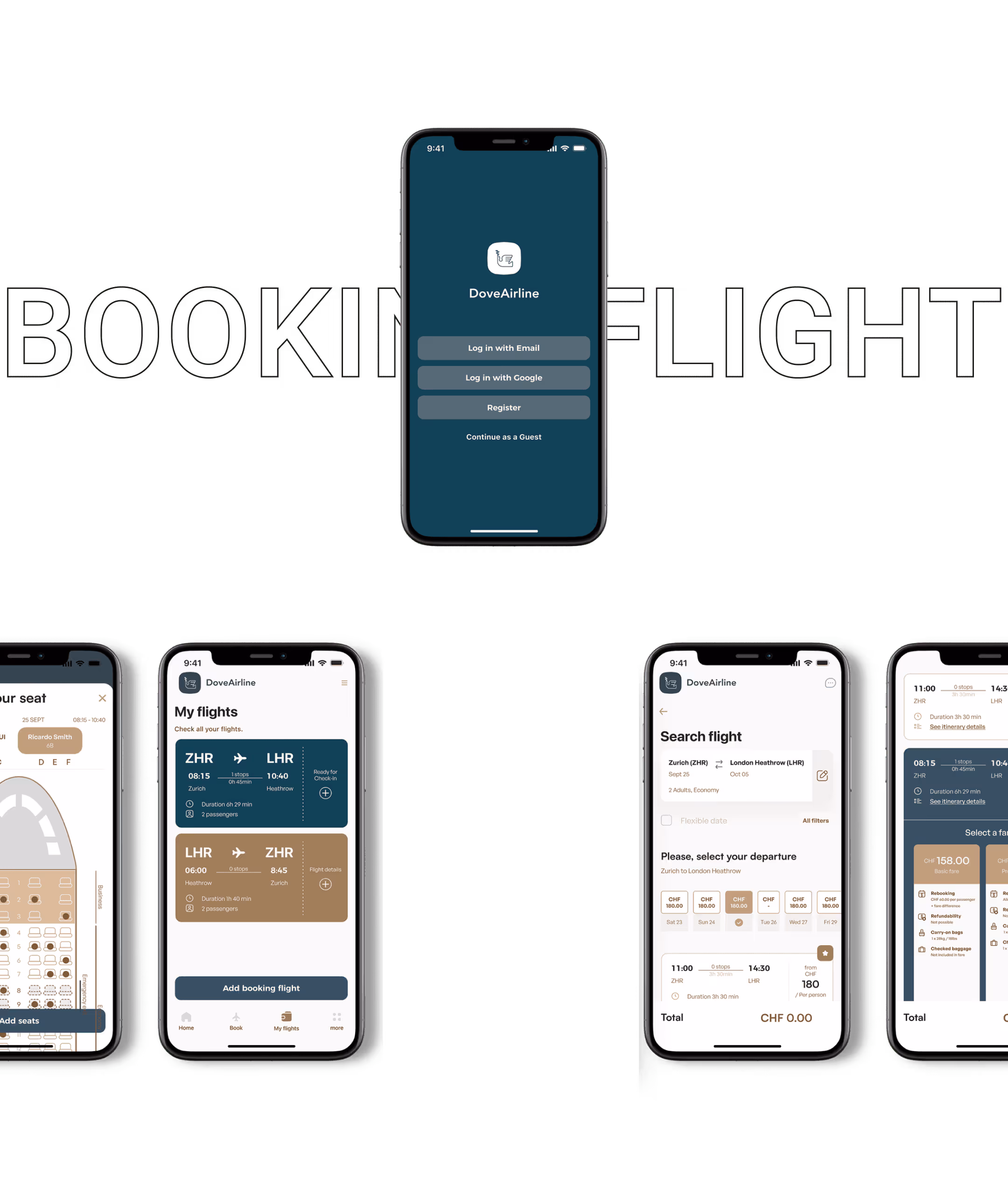
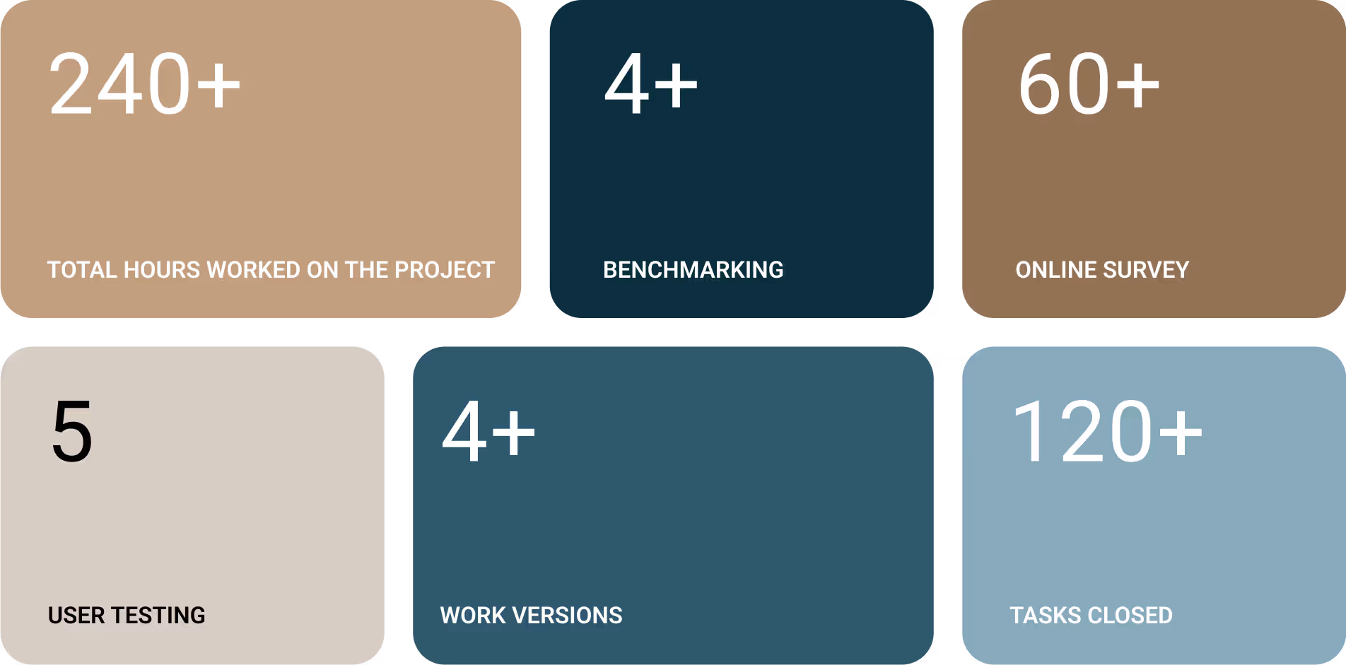
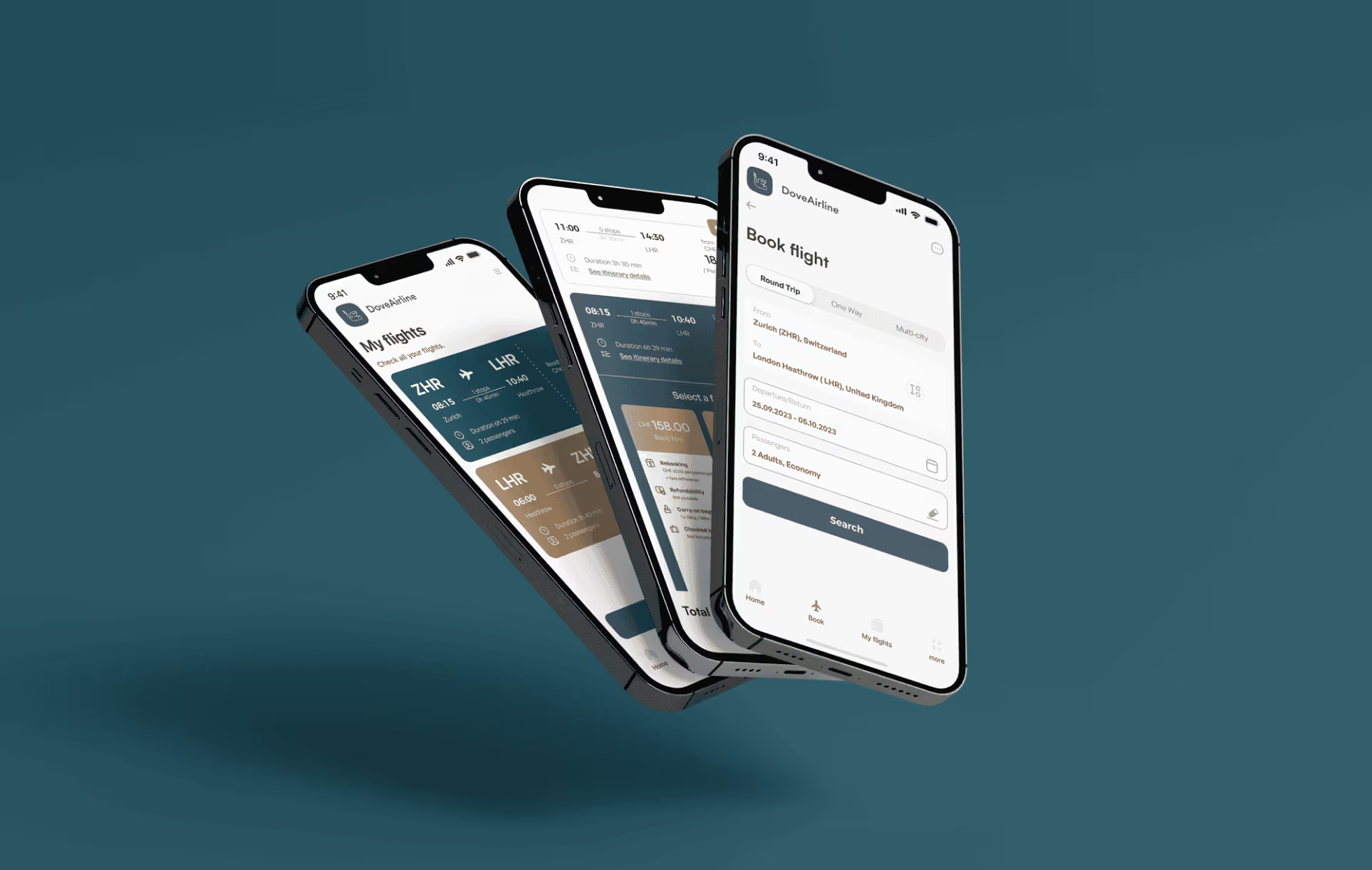
I used a mixed-methods research strategy to understand how people search for and book flights, and what frustrates them in existing airline apps.

Methods
• Competitive benchmarking (four airline apps + one travel aggregator)
• Quantitative survey (62 participants)
• User interviews
• Usability testing
• Note-taking and task observation

Key Questions
• What slows users down when booking flights?
• How do travelers compare different options?
• What information do they struggle to find?
• Which UI patterns create confusion or cognitive load?

Survey results
Research notes documenting user comments and friction points during interviews.

Competitive Benchmarking

I analyzed four airline apps and one travel aggregator to evaluate:

• Homepage structure
• Search flow (single & multi-city)
• Price visibility
• Filters & sorting
• Passenger details
• Payment flow

User Survey (62 responses)
The survey helped validate user habits, frustrations and expectations. Key findings:
• Users want simple filters and fast results
• Price transparency heavily influences trust
• Hidden fees create major frustration
• Long forms slow down the process
• Clear comparison tools are essential

4 competitive brands
Benchmark analysis comparing navigation, search flow, and pricing visibility across airline apps.
note-taking
/
usability test
To validate early assumptions, I conducted usability sessions with support from a fellow UX designer. Each session had two parts:

1. Contextual Onboarding
I started by understanding each participant’s travel habits, digital behaviour and expectations when booking flights. This helped identify their mental models and what information they prioritise.

2. Task-based Usability Test
Participants were asked to complete two flight-booking tasks in competitor apps. I observed:
• navigation patterns
• hesitation points
• where they expected certain actions to be
• confusion caused by unclear labels or visual hierarchy

Key Insights
• Users wanted faster access to filters and clearer price breakdowns
• Extra fees appearing late in the process created distrust
• Long forms caused frustration, especially when information was repeated
• Most users scanned, not read — highlighting the need for clean hierarchy
product stages
product stages
personas
/
customer journey
Personas & User Profiles
Based on survey and interview data, I identified three primary user archetypes:
"Hawa, a 41-year-old working mother traveling with family and a pet — needs flexibility and clear booking options."
"Frequent Business Traveler, values speed, efficiency and minimal steps."
"Retired Traveler, seeks simplicity, clarity and reassurance."


Why these personas matter
They allowed me to validate design decisions against real user needs — from multi-passenger bookings to simplified flows for less tech-savvy users.
product stages
flow diagram
Before designing, I wanted to make the process or flow system that details the steps necessary to complete the task of booking and purchasing a flight.
App map for the all screens
sketch
/
interaction
sketch of some screenssketch of some screens
APP SCREENS
onboarding screens
COLOR
PALETTE
colours used in the app
booking flight
/
screens
Creating a
Booking Experience
man inside a plane looking in his bag, search screen app
booking screen process
Decorative visual screen with all screen app
prototype
/
figma
Check Figma
conclusion & learnings
As a conceptual project, Dove Airline was never launched — so no real-world metrics could be collected.
Instead, the value of the redesign lies in validated user flows, clearer information architecture and positive feedback from usability tests.

What I learned:
managing full-cycle UX (from research to UI), importance of structuring complex booking flows, clarity in UX writing, and balancing user needs with design constraints.

What I’d do next:
refine the visual system, add edge-case flows (multi-city, pet travel, cancellations), improve accessibility, and extend testing to larger user samples.
Next case