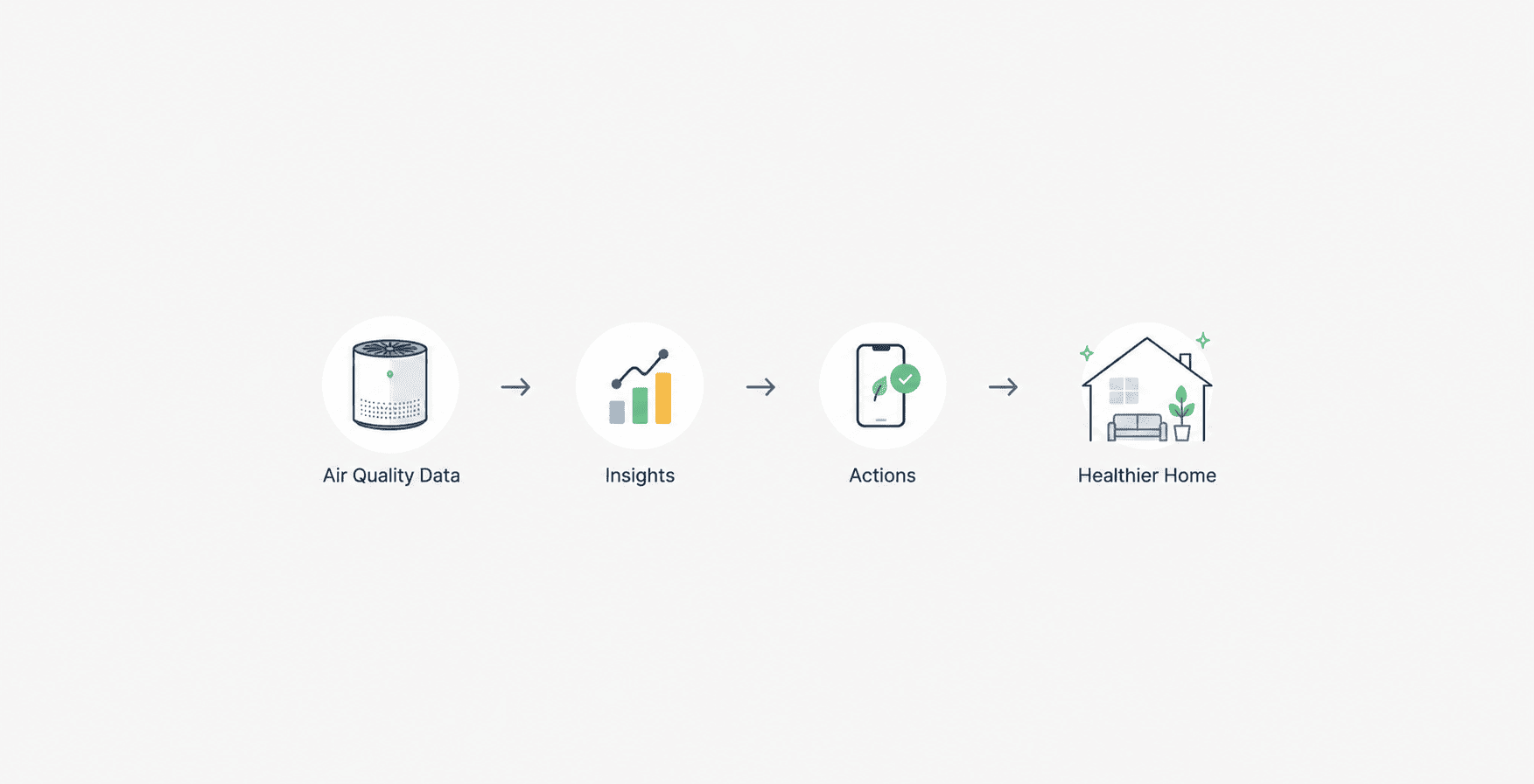
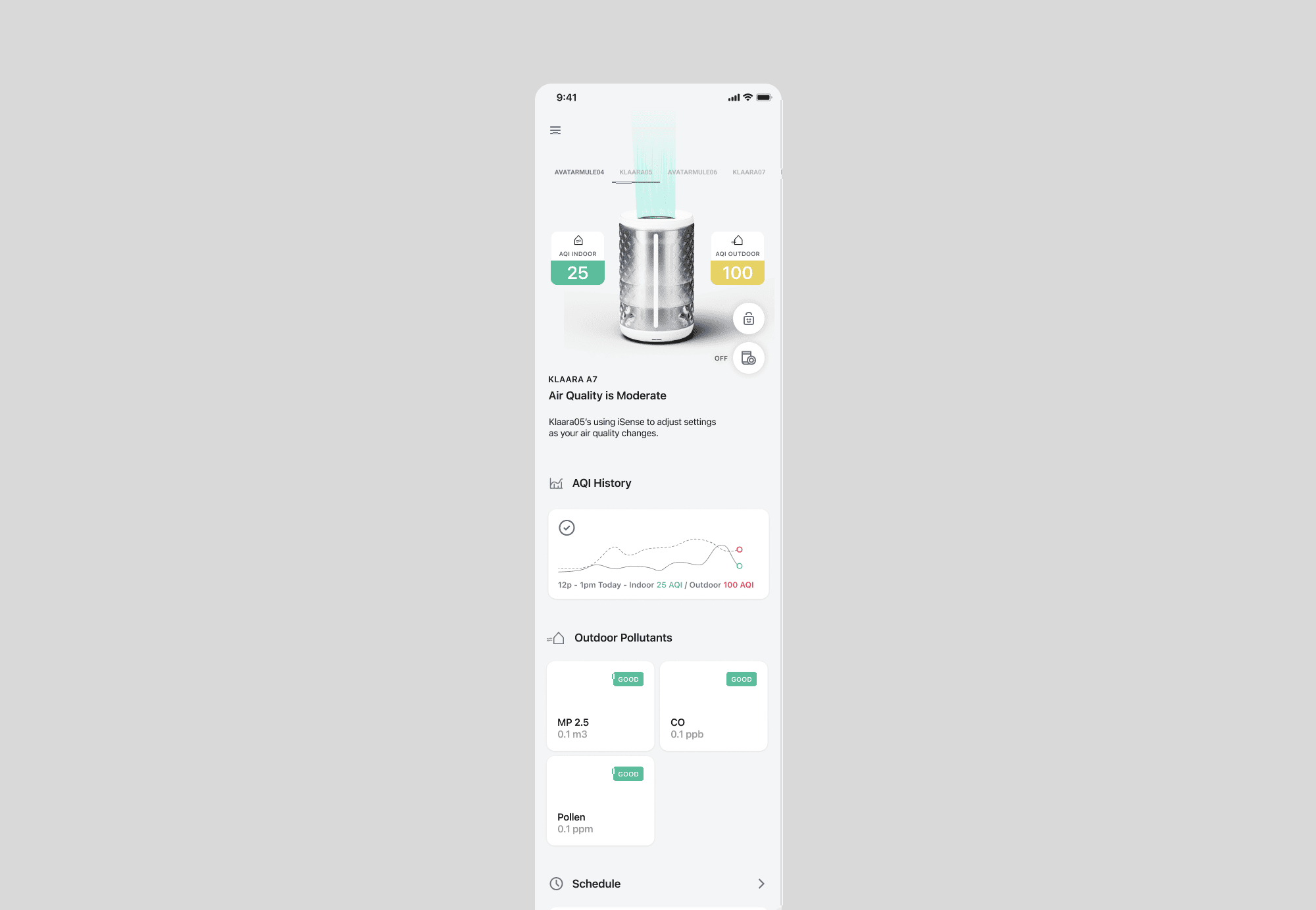
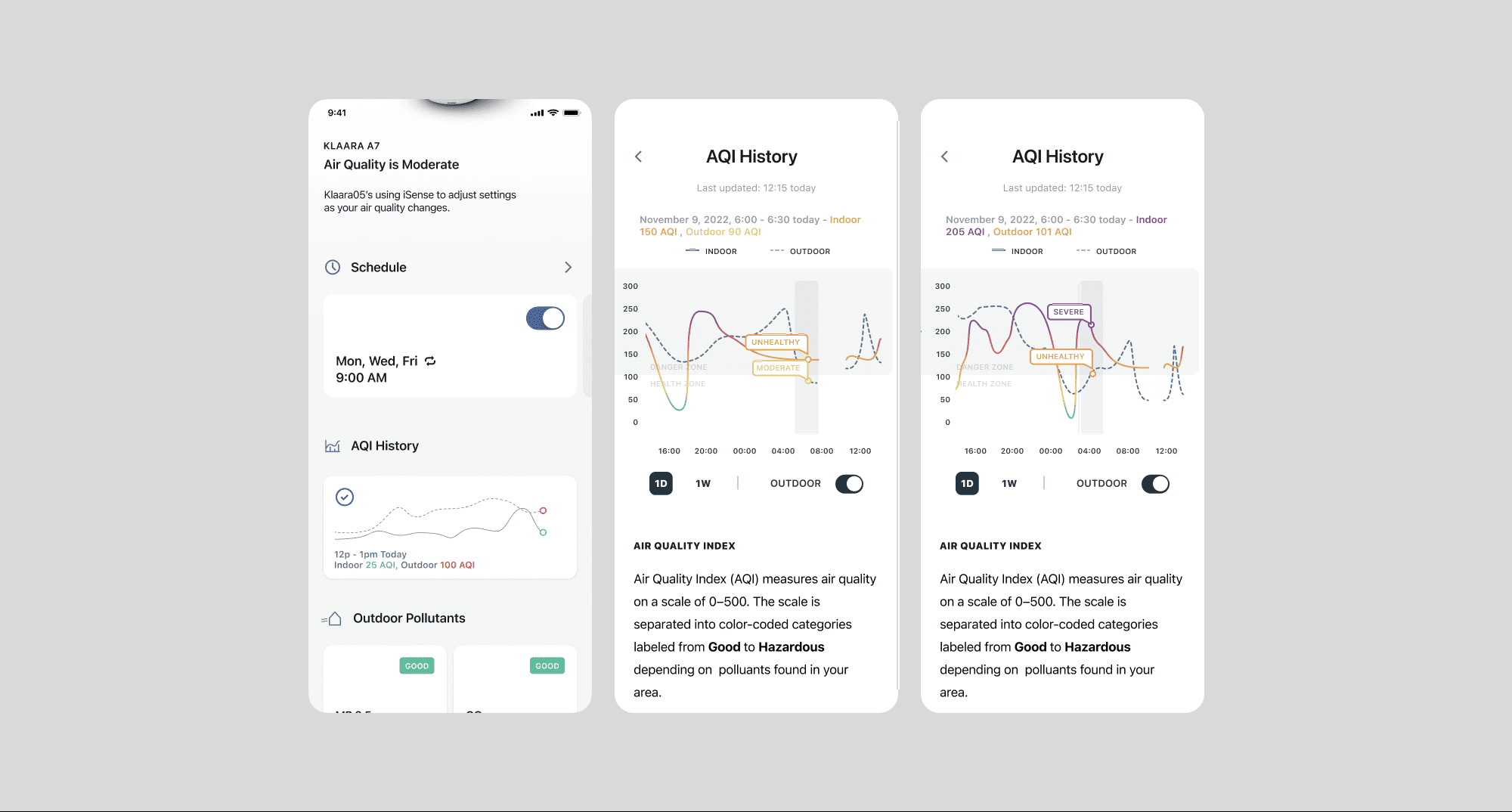
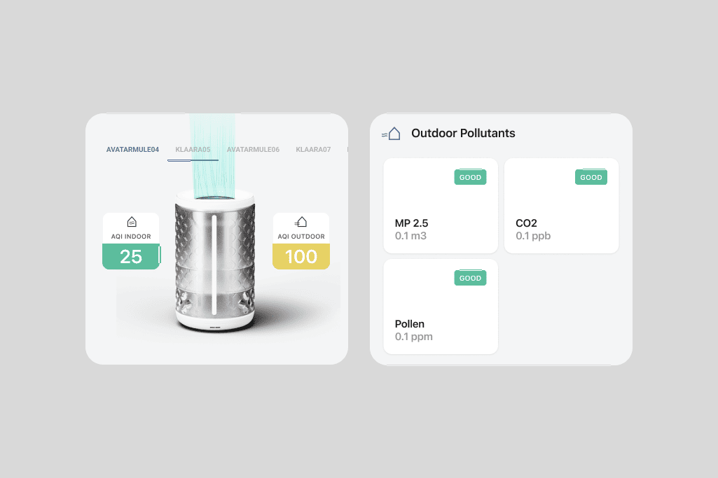
Prioritising air quality visibility over device controls
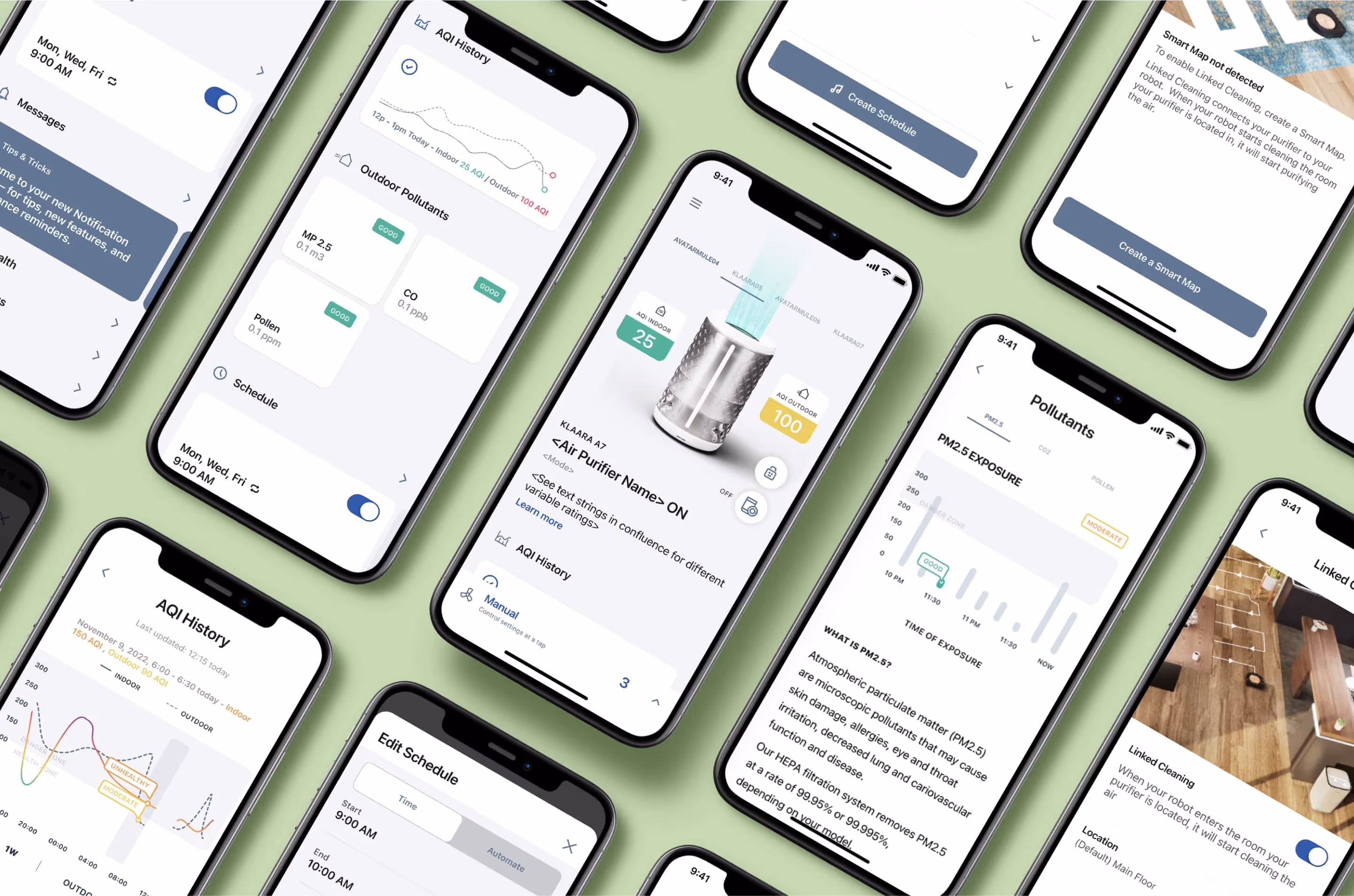
Research and stakeholder discussions revealed that users cared more about understanding their indoor air quality than manually adjusting settings. The experience was designed to make air quality insights easier to access and interpret.
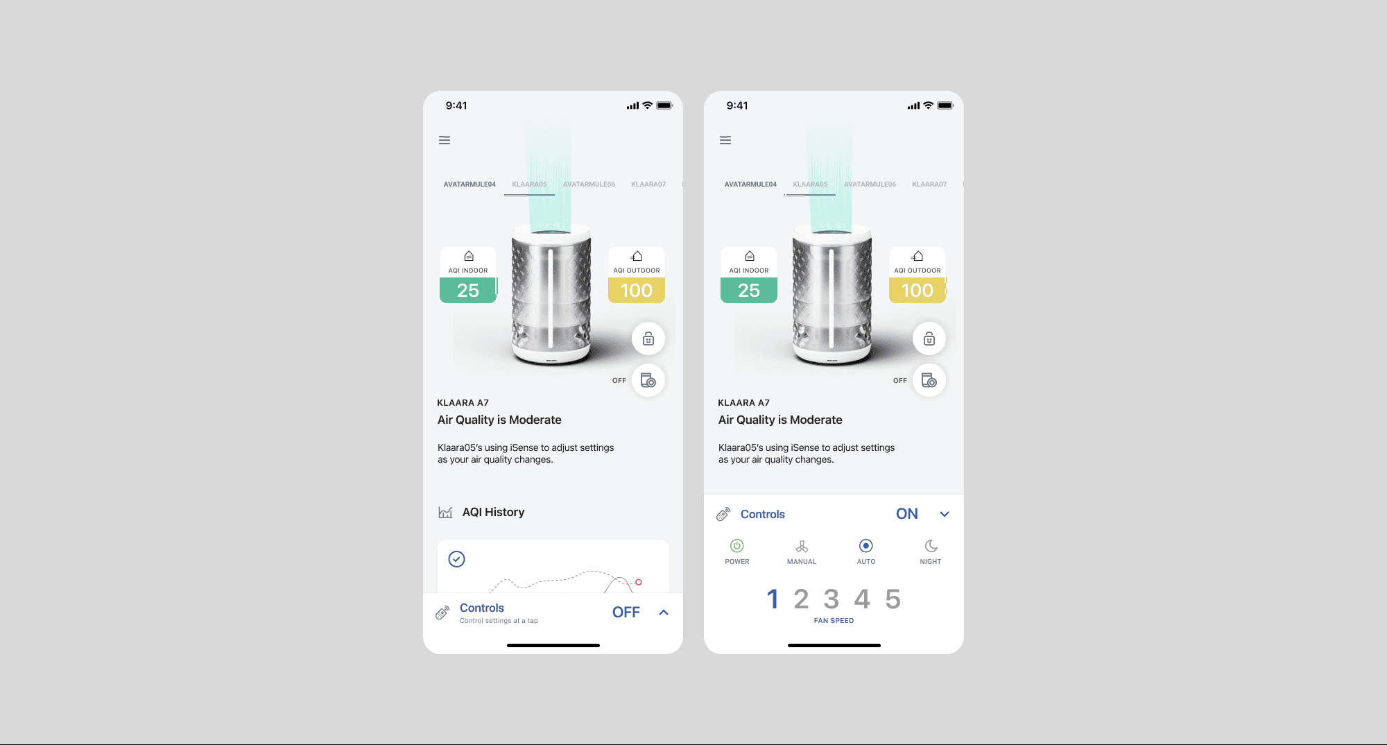
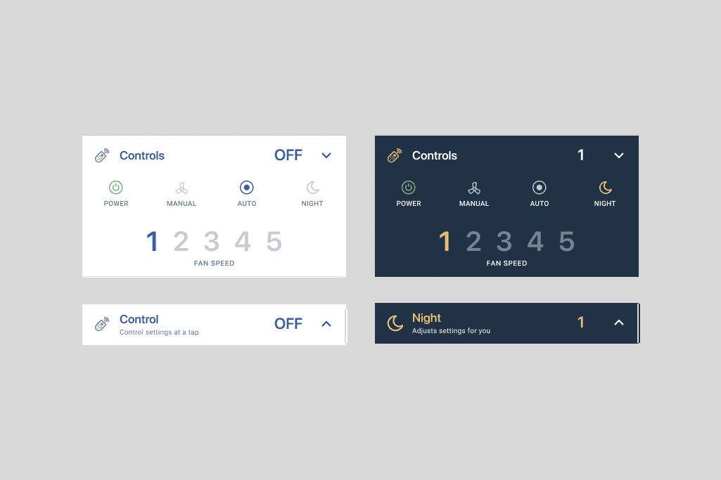
Simplifying purifier management through predefined modes
Rather than exposing advanced controls by default, the app relied on predefined modes such as Sleep, Fast and Manual to reduce complexity and support quicker decision-making.
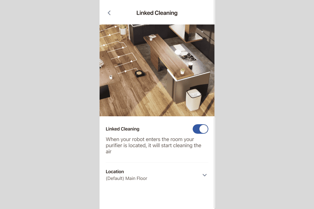
Creating a connected ecosystem experience
The linked cleaning feature was designed to automatically trigger purification after cleaning sessions, reducing manual effort and reinforcing the value of the broader iRobot ecosystem.