Designing a modern, transparent and intuitive financial management experience.
My Role: UX/UI Designer
Timeline: 2023
Project Type: Mobile App Β· Digital Banking Β· UI System Β· Product Design
Team: Independent Project
Client: Concept Project / Personal Case Study
introduction
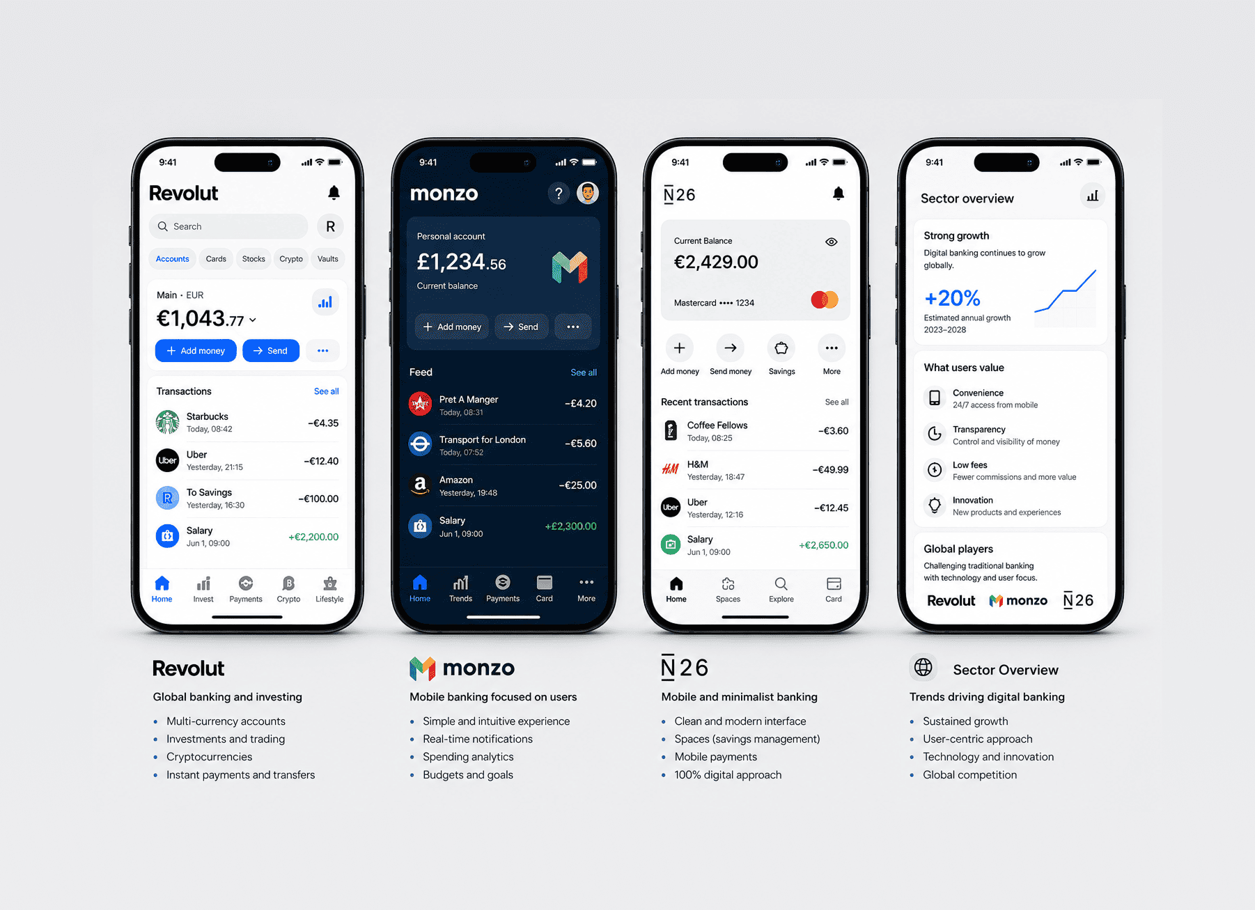
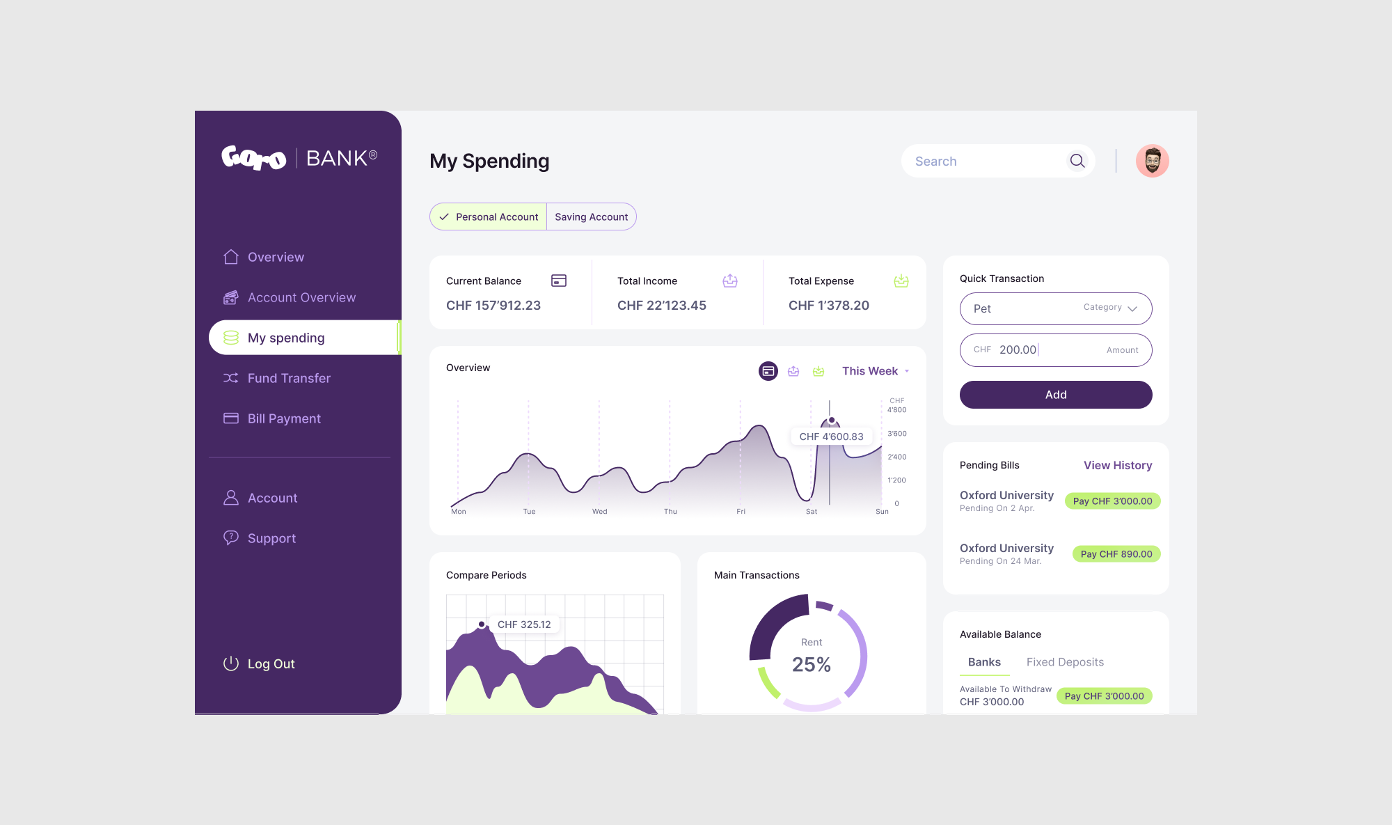
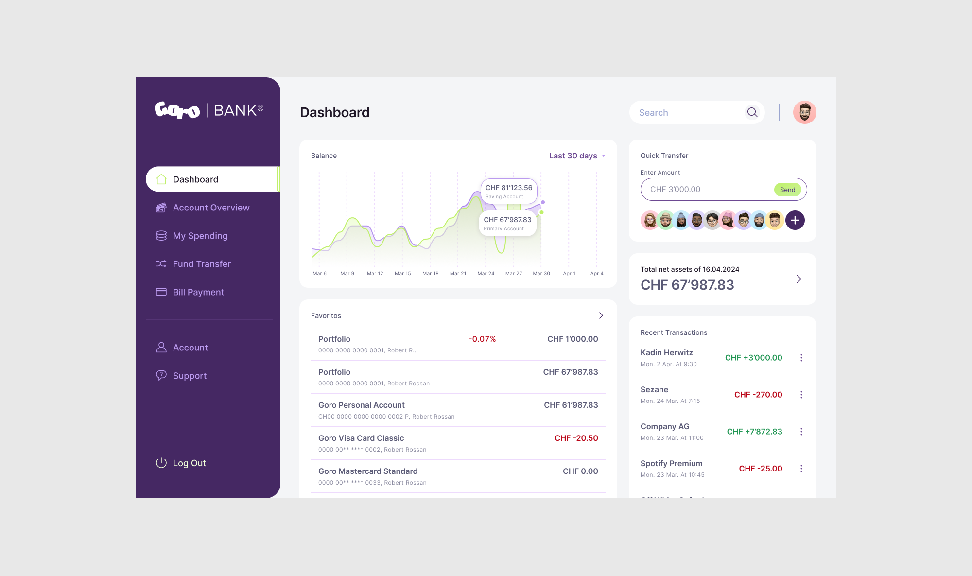
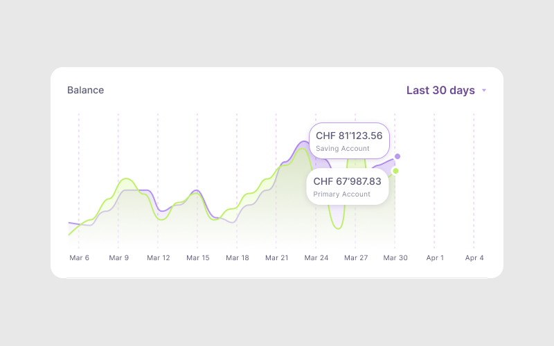
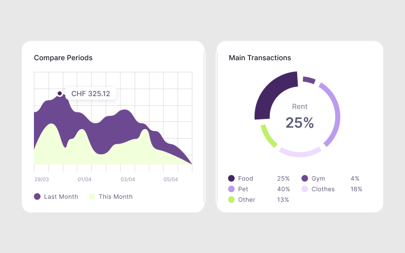
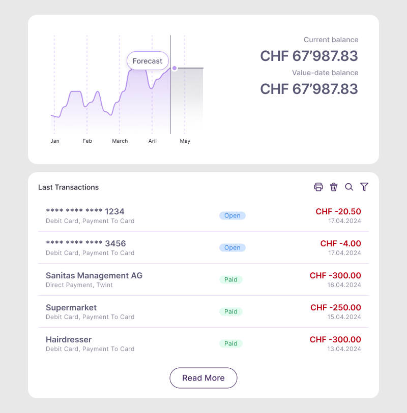
Goro Bank is a digital banking concept designed to offer a modern, transparent and intuitive financial experience. The original platform lacked clarity, hierarchy and emotional connection β critical elements for building trust in fintech.
My role was to redesign the core banking flows, interface components and visual identity to create a digital banking experience that feels modern, safe and effortless.
This case study includes UX analysis, flows, UI redesign, component system and visual direction.
Project objectives
ββ’ Improve clarity and readability of financial information. ββ’ Build trust through a structured, consistent UI. ββ’ Redesign essential flows (overview, transfers, card management). ββ’ Simplify navigation and reduce friction. ββ’ Establish a modern visual identity suitable for fintech. ββ’ Build reusable, scalable UI components. ββ’ Support confident decision-making with better hierarchy and structure
research & Design Process
Benchmarking
I analyzed leading digital banking apps β Revolut, N26, Monzo, Wise and Bunq β focusing on: ββ’ visual hierarchy ββ’ transaction structure ββ’ card management patterns ββ’ navigation depth ββ’ readability ββ’ component consistency. β These benchmarks helped define quality standards for clarity and trustworthiness.
UX Audit of the Existing Design
I evaluated the current interface in terms of: ββ’ insufficient spacing, ββ’ inconsistent patterns, ββ’ unclear hierarchy, ββ’ poor task grouping, ββ’ weak visual structure, ββ’ limited scalability.
User Expectations (Conceptual Research)
Users of digital banks expect: ββ’ instant financial clarity ββ’ fast access to essential actions, ββ’ predictable navigation, ββ’ transparency in fees and transfers, ββ’ easy-to-scan layouts.
Web App Benchmarking β UX/UI Patterns
Problem Definition & Insights
Insight 1
Lack of Financial Clarity
Balances, card details and recent activity were visually mixed, making it hard to understand financial status at a glance.
Insight 2
Unpredictable Navigation
Important actions like transfers or card security required too many taps.
Insight 3
Weak Visual Hierarchy
Everything had similar weight, making scanning difficult.
Insight 4
No Trust-Building UI Language
The visual identity did not support the credibility expected from a financial product.
Insight 5
Inability to Scale
The layout and component choices would not support future growth such as analytics, savings goals or subscriptions.
Personas & Needs
Persona
A tech-aware, digital-first banking user who expects efficiency, effortless control and security.
Persona: Alex Garcia Age: 33 Occupation: Freelance Designer Tech Level: High Primary Device: Laptop Financial Behavior: Uses web banking daily to manage personal and work-related finances.
Story
βAs a digital-first freelancer, I need a banking platform that allows me to quickly understand my financial status, manage multiple cards, and perform transfers with confidence. I rely on clear interfaces that reduce cognitive load and help me stay organized.β
Needs & Goals
ββ’ Immediate clarity on balance and spending. ββ’ Fast and error-free transfers. ββ’ Easy card controls (freeze, limits, security). ββ’ Clean, modern and trustworthy interface. ββ’ Financial insights that are easy to understand. ββ’ Predictable navigation and simple flows.
Pain Points
ββ’ Overwhelming home dashboard. ββ’ Transaction list lacks visual hierarchy. ββ’ Card security actions are buried. ββ’ Too many steps for basic tasks. ββ’ Unclear terminology and labels. ββ’ UI feels outdated and reduces trust.
Digital Behavior
ββ’ Prefers editing, banking and managing tasks on desktop. ββ’ Checks balance frequently. ββ’ Does most financial actions online. ββ’ Expects high clarity and modern design.
Research Findings
Financial Clarity Issues
Users struggle to understand their financial status because the overview page mixes balance, cards and recent activity without clear hierarchy.
Navigation Requires Too Many Steps
Essential actions such as transfers or card security require several screens, increasing friction and slowing down task completion.
Card Controls Are Hard to Find
Freeze, limits or security options are buried deep in the UI, making quick card actions difficult at critical moments.
Weak Visual Hierarchy & Inconsistent UI Patterns
Spacing, alignment, button styles and components vary across the experience, reducing scannability and making the interface feel unreliable.
Missing Spending Insights & Analytics
Users lack a clear breakdown of categories, trends or unusual activities, making it hard to understand where money goes.
Low Trust Due to Outdated Visual Style
The current visual language does not match user expectations for a modern fintech product, reducing perceived security and credibility.
Current Journey & Pain Points
Pain Points Identified
ββ’ Overwhelming and crowded home screen. ββ’ Key actions hidden behind multiple steps. ββ’ Transaction list lacked readable distinction between items. ββ’ Card security actions were buried. ββ’ Layout made it difficult to expand features. ββ’ Lack of predictability across navigation. β These pain points defined the roadmap for the redesign.
Customer Journey map
Context & User Expectations
Context
ββ’ Desktop-first usage. ββ’ Short, focused interactions. ββ’ Needs clarity under pressure. ββ’ Compares with modern fintech UI. ββ’ Trust and transparency are essential.
Before moving into visual design, I created wireframes to: β’ establish strong hierarchy β’ reduce cognitive loadvalidate the new navigation structure β’ define card interactions and transfer flows β’ structure transaction categories and insights β’ set spacing, content rhythm and alignment rules
These wireframes ensured clarity and consistency early in the process.
Before redesigning flows, I created an App Map to understand the overall structure, dependencies and navigation depth.
App Map / Information Architecture
Moodboard & Visual Direction
This moodboard explores visual references from modern fintech brands, clean editorial layouts and clarity-driven UI systems. These references guided the visual direction of Goro Bank before the color and typography system was defined
visual identity
Color System
βThe palette combines: ββ’ deep blues to evoke trust and stability, ββ’ bright accents to signal key actions and modernity, ββ’ neutral greys to support readability and focus.
This creates a calm yet contemporary fintech identity.
Typography
A clean sans-serif typeface optimized for numerical data and financial summaries: ββ’ strong hierarchy, ββ’ excellent readability, ββ’ flexible scale for different screen sizes.
visual design system
βI developed a scalable component system that supports current and future product needs: ββ’ button system (primary, secondary, utility), ββ’ interactive card UI (freeze, limits, insights), ββ’ transaction rows, ββ’ filters, chips and category tags, ββ’ graph components and data blocks, ββ’ bottom navigation, ββ’ form fields and validation states, ββ’ alert, error and success messages, ββ’ spacing, elevation and shadow tokens.
This ensures consistency across features and accelerates growth.
Key Screens
Home / Overview
A clear snapshot of money at a glance β balance, insights, recent activity and quick actions.
Cards Section
Interactive card stack with security actions, limits, spending breakdown and freeze/unfreeze.
Transactions
Readable, categorized and visually structured items that users can quickly scan.
A visual overview of spending habits using simple and human-readable charts and blocks.
Final UI & Design System
The polished UI brings together all components and patterns into a coherent, modern and trustworthy visual experience.
The final design supports clarity, confidence and efficiency across the entire banking experience.
Results & Expected Impact
Expected improvements: ββ’ Faster completion of banking tasks, ββ’ Clearer understanding of financial health, ββ’ Higher user trust, ββ’ Increased discoverability of features, ββ’ Reduced cognitive load, ββ’ Stronger and more consistent brand identity, ββ’ A scalable foundation for future features (analytics, savings, automation).
βThough this is a conceptual project, the improvements strongly align with industry standards.
Learnings & Reflection
This project strengthened my skills in: β’ designing complex financial workflows, β’ building component systems with scalability in mind, β’ simplifying high-risk actions such as transfers, β’ applying accessibility and readability to numerical data, β’ combining modern fintech aesthetics with clarity and trust
What I enjoyed most was turning a dense, unclear interface into a calm, structured and intuitive experience that supports users in feeling in control of their money.