To comply with the NDA, limited information is shared the following case study ⚠️ This product is NOT in the market yet ⚠️
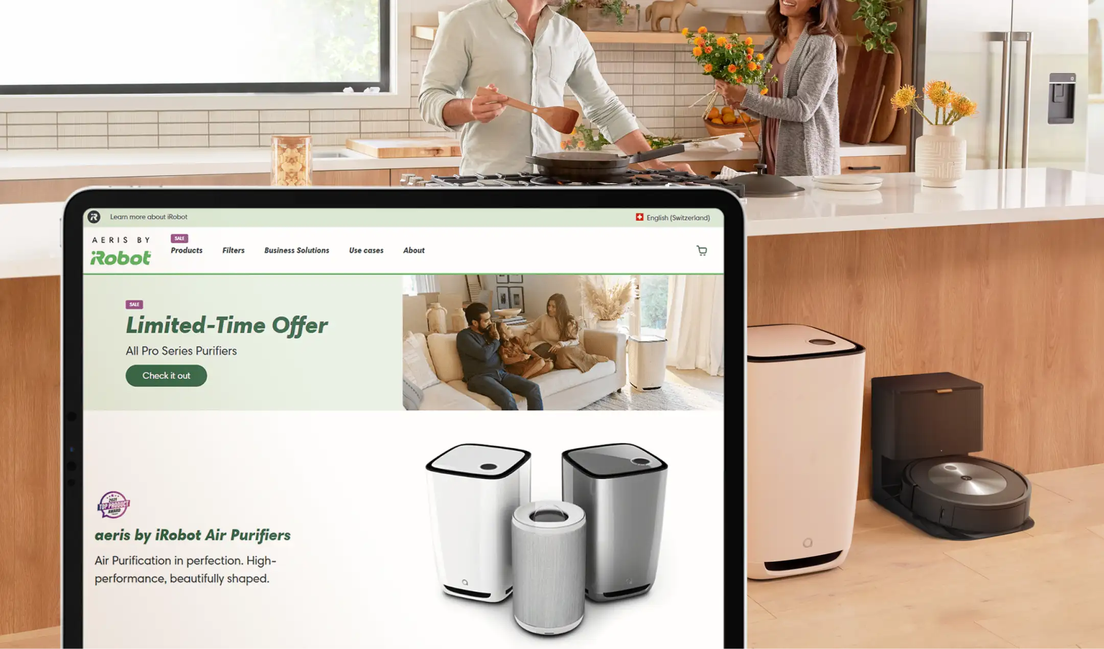
aeris by iRobot air purifiers in a modern kitchen while a couple cooks, representing a healthy home environment.
the challenge
/
approach

The challenge

This project presented both brand and UX challenges.

Brand challenge
How do you introduce a non-robot product into a robotics-driven identity without confusing users?

E-commerce challenge
Air purifiers come with filters, replacements, and accessories. Without clear guidance, this can create cognitive overload and purchase hesitation.

Conversion challenge
Bundles increase value — but they can also increase complexity.
We needed to structure bundles in a way that improved clarity rather than adding friction, especially at the cart stage.

Approach

Before designing, I focused on three key principles:

1. Clarity over feature density

Air quality metrics and filtration details can quickly become technical. The structure needed to simplify decision-making.

2. Decision architecture, not upselling

Bundles should feel helpful, not promotional.

3. Consistency with flexibility

The experience had to align with the existing iRobot ecosystem while accommodating the different nature of this product category.
product page
/
details
The PDP was designed to balance education and conversion.

Key decisions:

Structured information hierarchy

Benefits were surfaced before technical specifications to reduce cognitive load.

Progressive education

Instead of presenting all filtration data upfront, content was layered to support different levels of user curiosity.

Trust reinforcement

Visual clarity, spacing, and certification indicators supported credibility in a category where health and safety are key concerns.

Ecosystem alignment

The design system followed existing iRobot patterns while subtly adapting to reflect a stationary product rather than an autonomous robot.
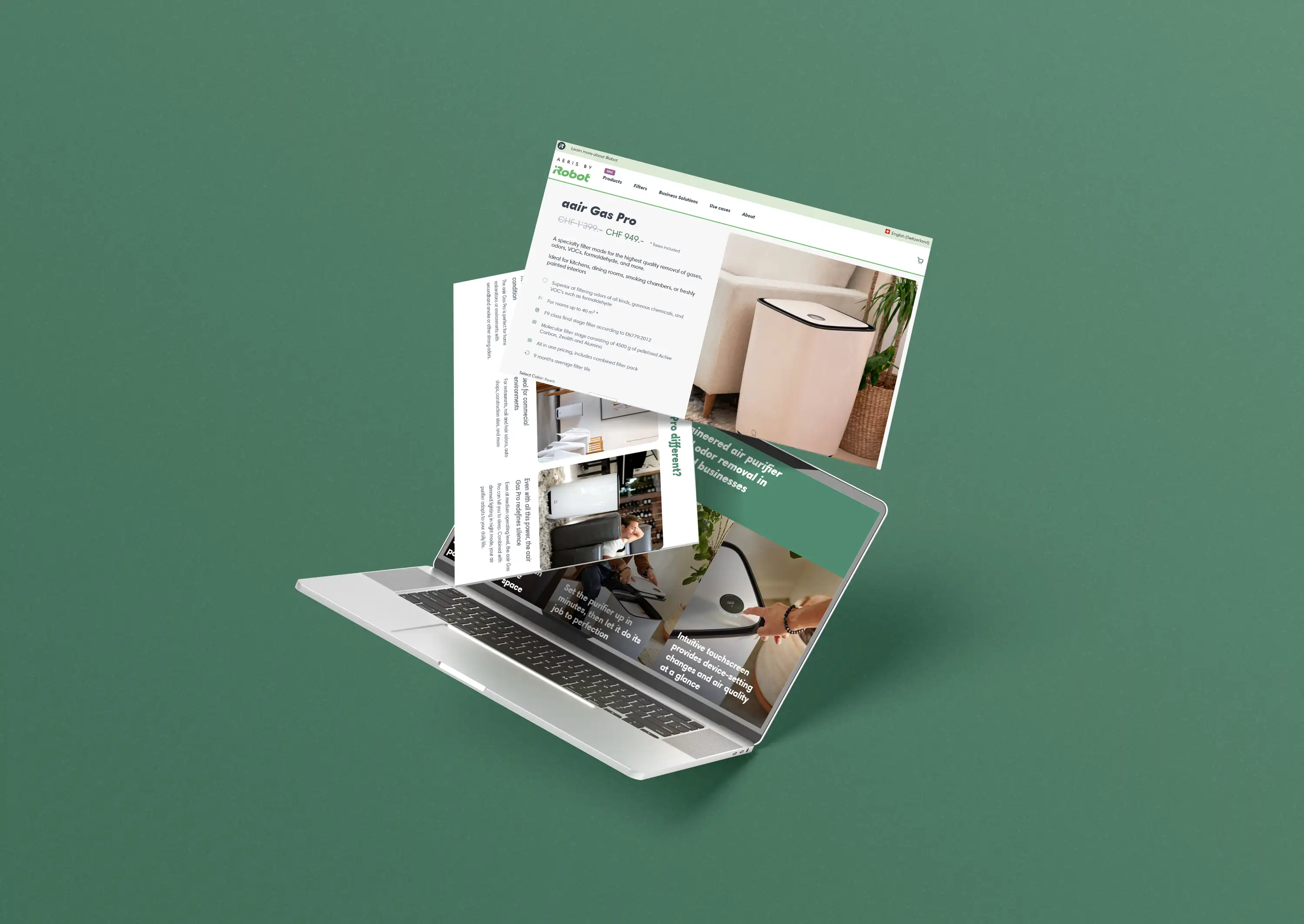
Laptop mockup displaying the aeris by iRobot website with air purifier product pages and details.
aerie by iRobot online shop product page
bundle strategy

Architecture

Air purifiers require recurring filter replacements and optional accessories.
Without clear guidance, this can increase decision fatigue and reduce conversion.

The challenge was not to sell more, but to structure choices in a way that reduced friction.

Key UX Consideration

How many bundle options are too many?
Where should bundles appear in relation to the main CTA?
How do we communicate savings without overwhelming the user?
How do we avoid creating doubt at the cart stage?

UX decisions

Curated bundles instead of customizable configurations
Clear price anchoring and savings communication
Contextual explanation of why filters matter
Seamless transition of bundle information into the cart
Cart Experience Optimization
Introducing bundles required adjustments to the cart experience.

The focus was on reducing last-step uncertainty.

Improvements included:
Clear visibility of included bundle components
Persistent savings communication
Easy editing without disrupting the purchase flow
Cleaner visual hierarchy in the cart summary

The objective was to reinforce confidence at the final decision point.
Check Figma
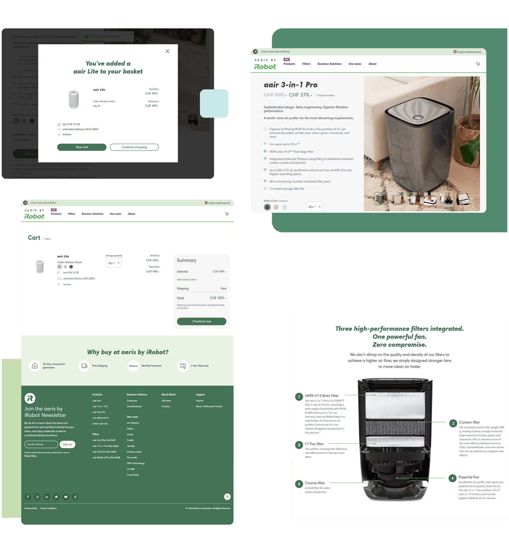
Shopping cart page of aeris by iRobot showing a selected air purifier, order summary, and checkout button.
Shopping cart screen of the aerie by irobot online shop
outcome
Successful integration of a new product category within the iRobot ecosystem
Clearer bundle structure supporting value perception
A scalable PDP framework for future category expansion
A more friction-aware cart experience

This project extended beyond a single product — it established structural foundations for category growth.
Key Learnings
Designing for e-commerce is designing for decision-making.

Introducing a new category into an established brand requires balancing:
• Consistency
• Education
• Simplicity
• Business objectives

This experience strengthened my understanding of conversion-focused UX and the importance of structuring complexity into clarity.

Final designs
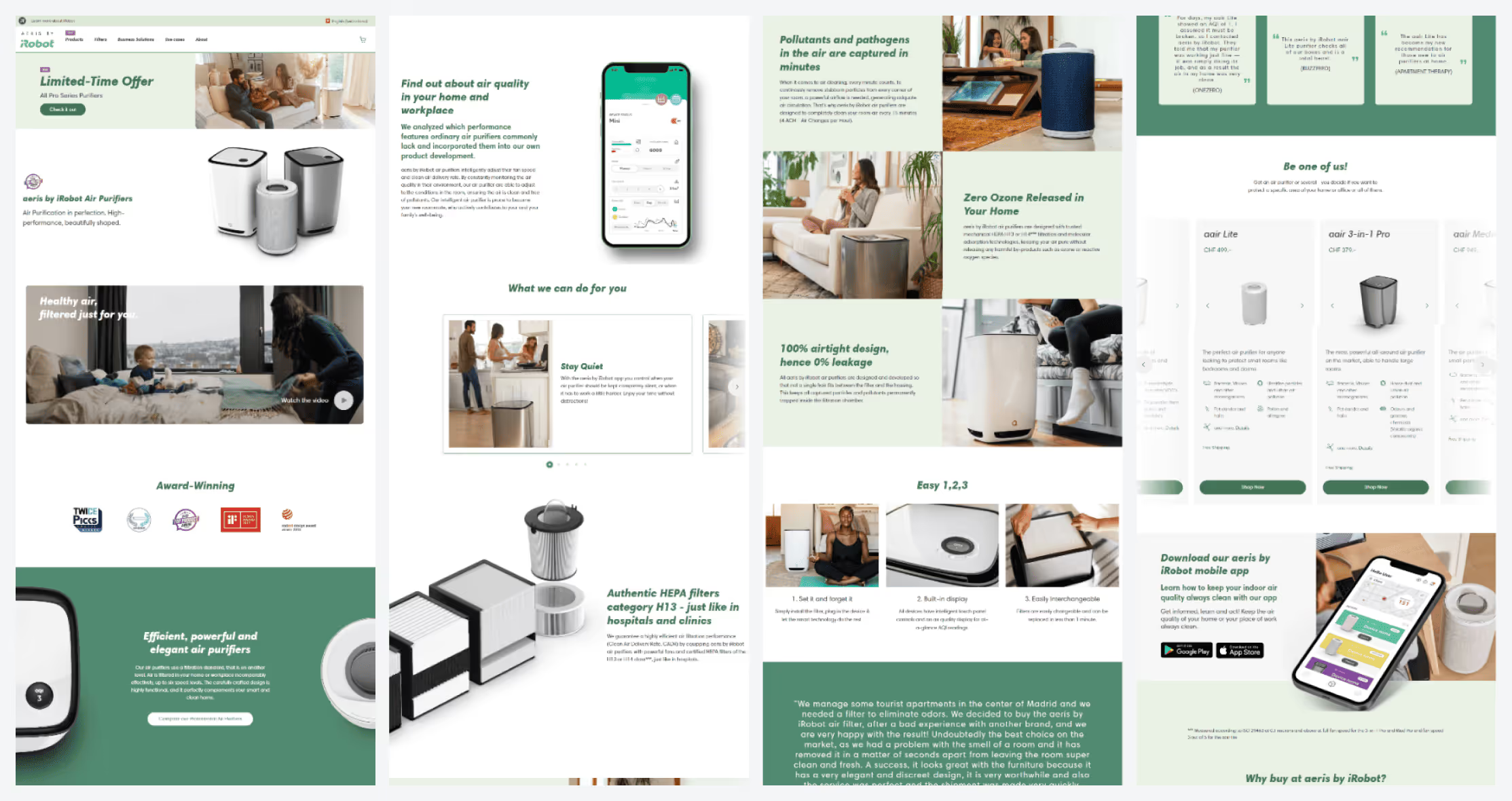
Some screenshot taken from the aeris wbsite
Product landing page created to support the purifier launch across the iRobot ecosystem.
Some screenshot taken from the aeris wbsite
E-commerce product detail layout explaining key features, modes and filters
Some screenshot taken from the aeris wbsite
Product landing page created to support the purifier launch across the iRobot ecosystem.
Next case