Product Design Portfolio
A comprehensive design system for a global commodities trading company running its internal product portfolio on Mendix, a low-code enterprise platform. The system covers foundations, base components and application-level patterns — all built to work consistently across desktop, tablet and mobile.
Role
Senior UX Designer
Timeline
1 yr. 6 mos.
Services
Design System, Component Library, UX Design, UI Design, Documentation
Year
2024–2025
Industry
Enterprise / B2B / Low-code
Cover of the Mendix design system with the client's brand mark and title.
Project overview
As the company's design team scaled and more products came onto Mendix, each designer was building components from scratch. Every project had its own buttons, its own typography, its own colour choices. From the outside, it looked like a dozen different companies had built the tools. I led the design and construction of the company's first proper Mendix design system, working on it alone through most of 2025.

The scope spans foundations (design tokens, layout grids across three breakpoints), base components (inputs, buttons, tables, dropdowns) and 20+ application-level patterns that enterprise products need but rarely have designed once.
Challenge
Questions to the design team were often "why does this look different from the other tool?" rather than "does this solve my problem?". The cost was compounding — every new project inherited the fragmentation of the previous ones.

The situation before the system existed was expensive in three ways: for clients and internal departments, inconsistency across products created constant friction — users moved between tools daily and had to relearn the same patterns every time. For designers, every project started at zero, adding weeks to every new project. For developers, translating inconsistent designs meant more back-and-forth, more edge cases, more tickets.
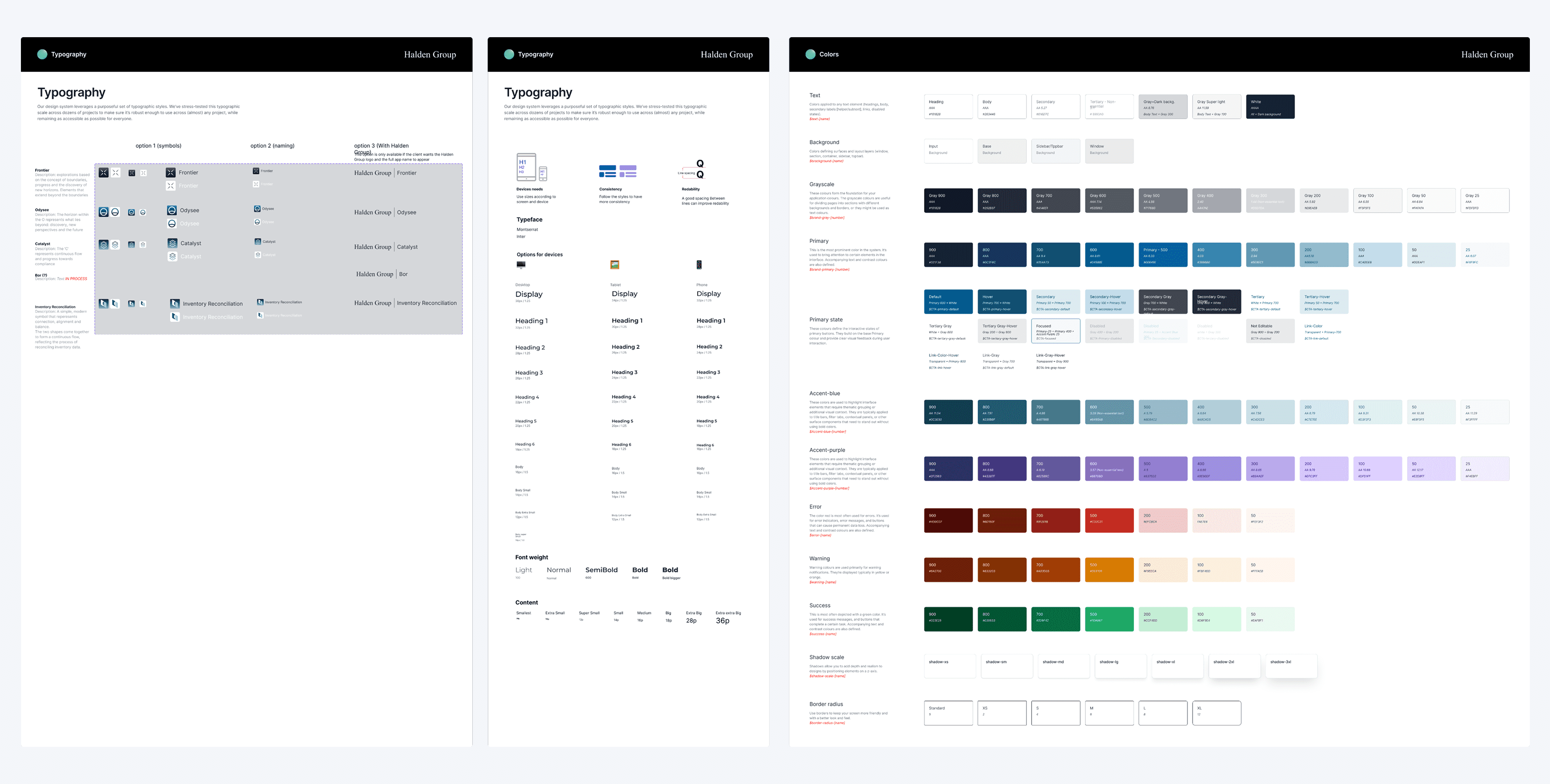
Overview of the design system's styleguide page showing typography, colour palette and table components in a single library.
Solution
The system extends the Mendix visual language rather than replacing it — keeping adoption fast for developers already familiar with the platform, while giving every new product a consistent visual and interaction baseline. Multi-breakpoint from day one (desktop 12-col, tablet 8-col, mobile 6-col) so responsive behaviour didn't need retrofitting later.

A layered system built foundations-first: design tokens (typography, colour, spacing, effects, grids) before base components (inputs, buttons, tables, dropdowns), and base components before application-level patterns (command palette, user profile card, app switcher, status transitions, approval history).
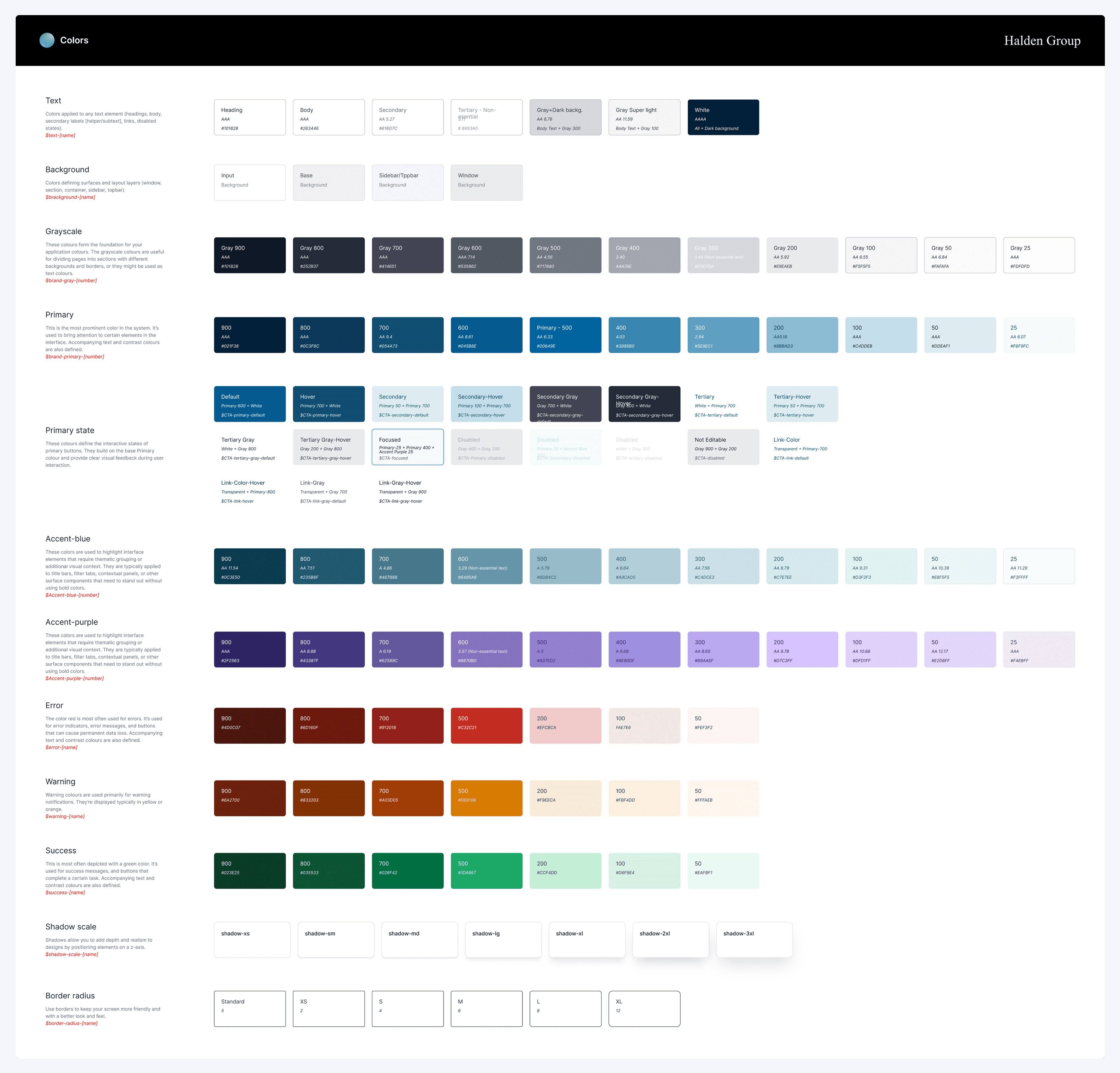
Colour palette showing multiple families with tint and shade ranges across the design system.
Design tokens for typography (multi-breakpoint scales), colour (families with tint/shade ranges), spacing, effects and layout grids. Every component consumes tokens — no hardcoded values downstream.
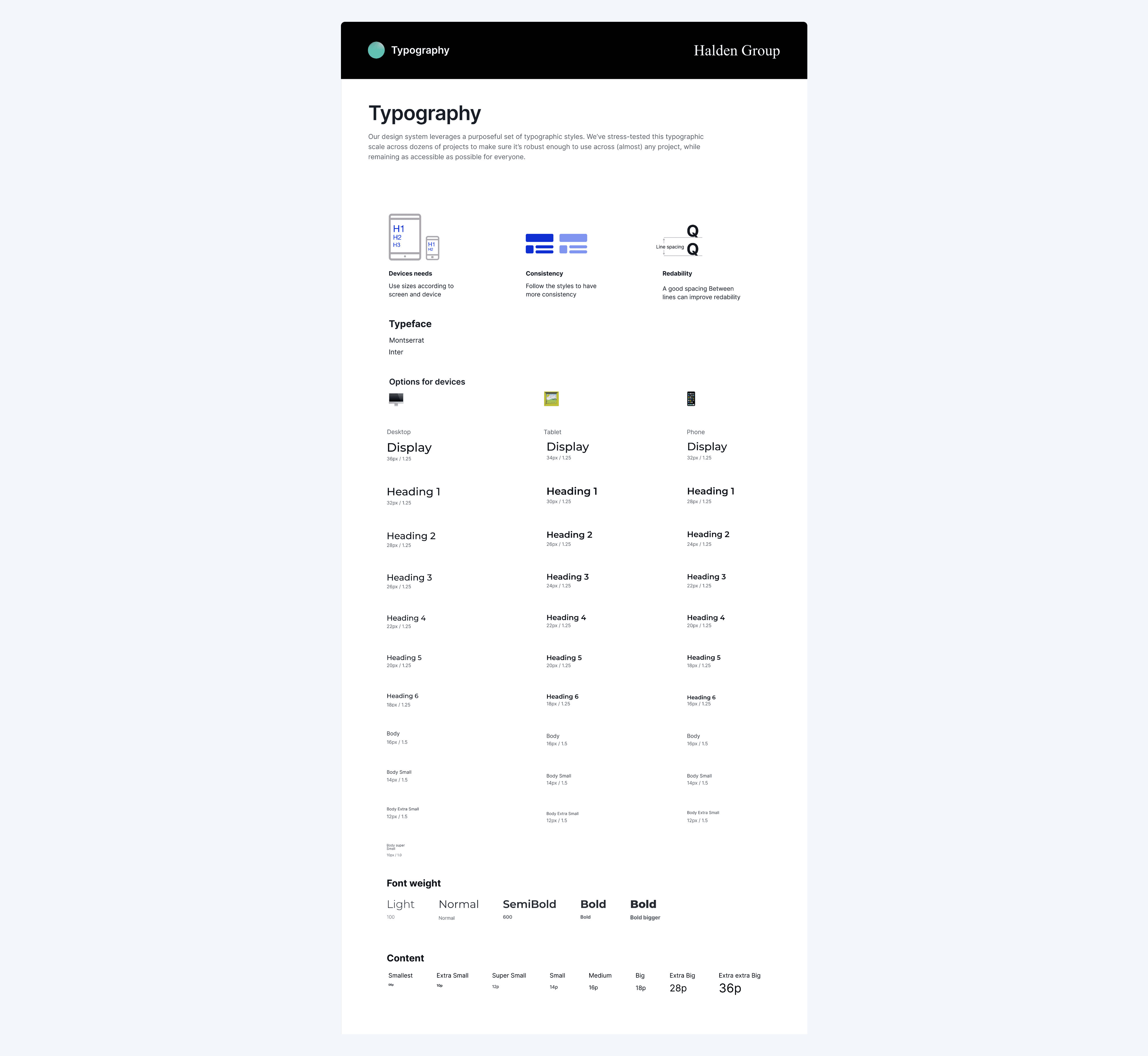
Typography system with responsive scales for desktop, tablet and mobile breakpoints.
Every foundational token — colour, typography, spacing, effects — is defined once and consumed everywhere. Change a token and every downstream component updates automatically.
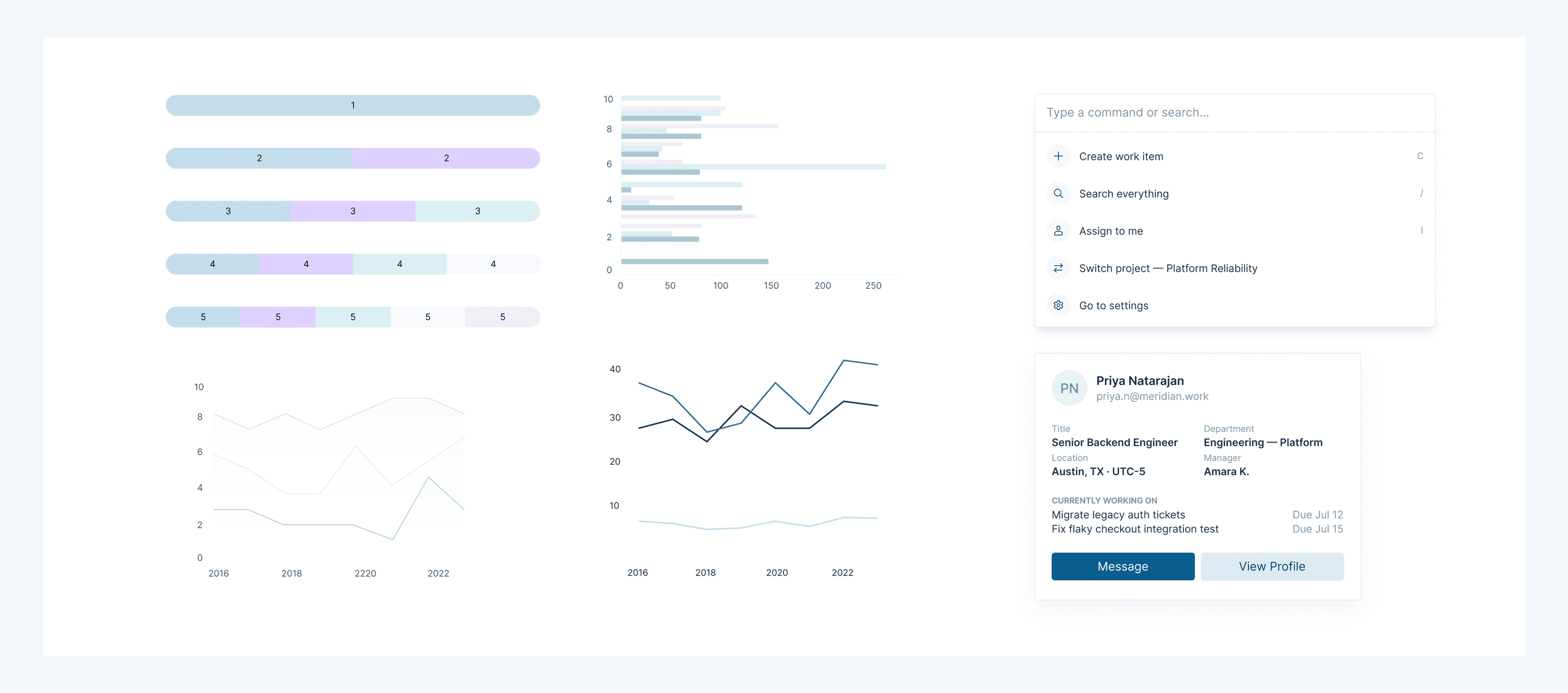
Application-level components including command palette, user profile card and chart widgets from the design system.
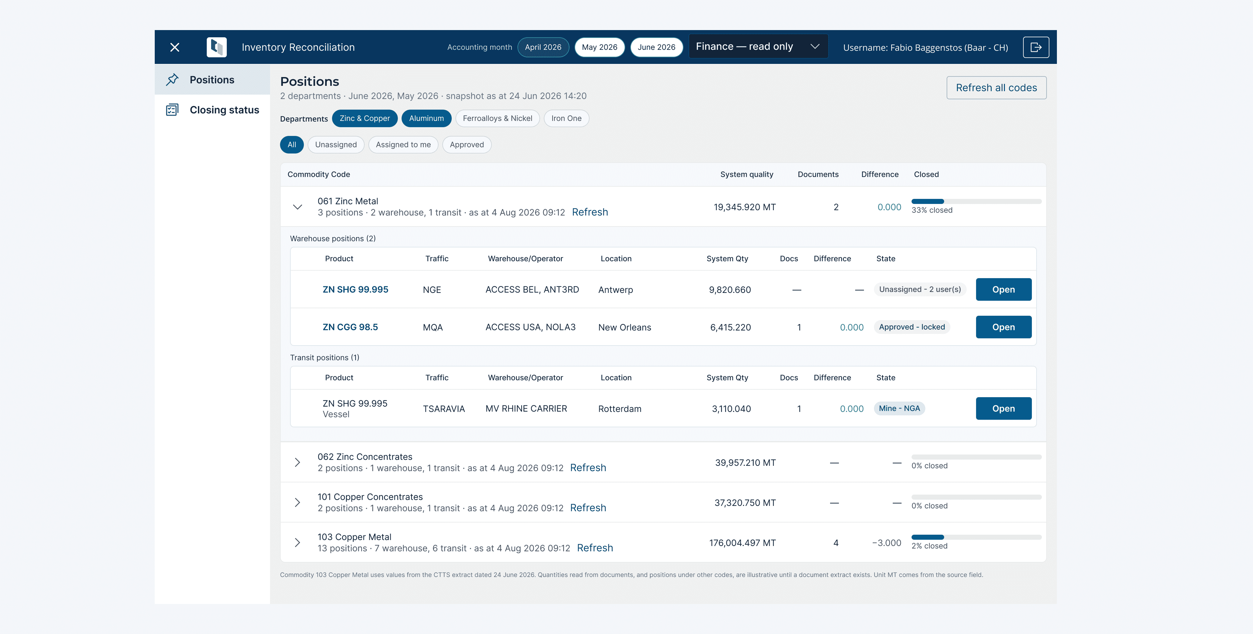
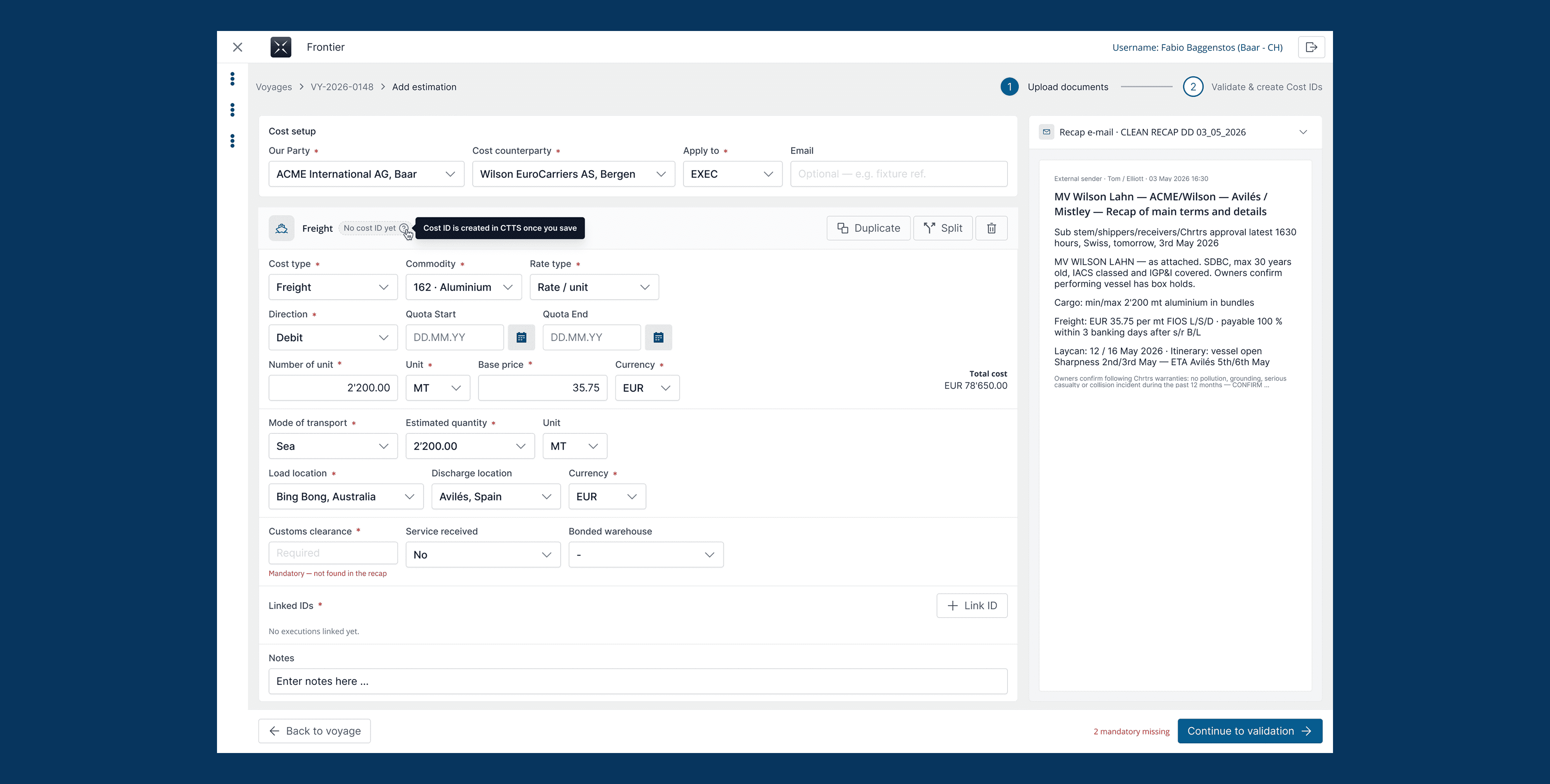
20+ application-level patterns pre-built for enterprise contexts: command palette, user profile card, app switcher, approval history, recent items menu, status transitions. The pieces enterprise products need but rarely have designed once.
Key Features
Foundations first
The single source of truth for every downstream decision — from typography scales to grid systems across desktop, tablet and mobile.
Built to grow
The system is built to scale with the platform — new patterns get added through structured discussion, keeping quality high as coverage grows.
Documentation built-in
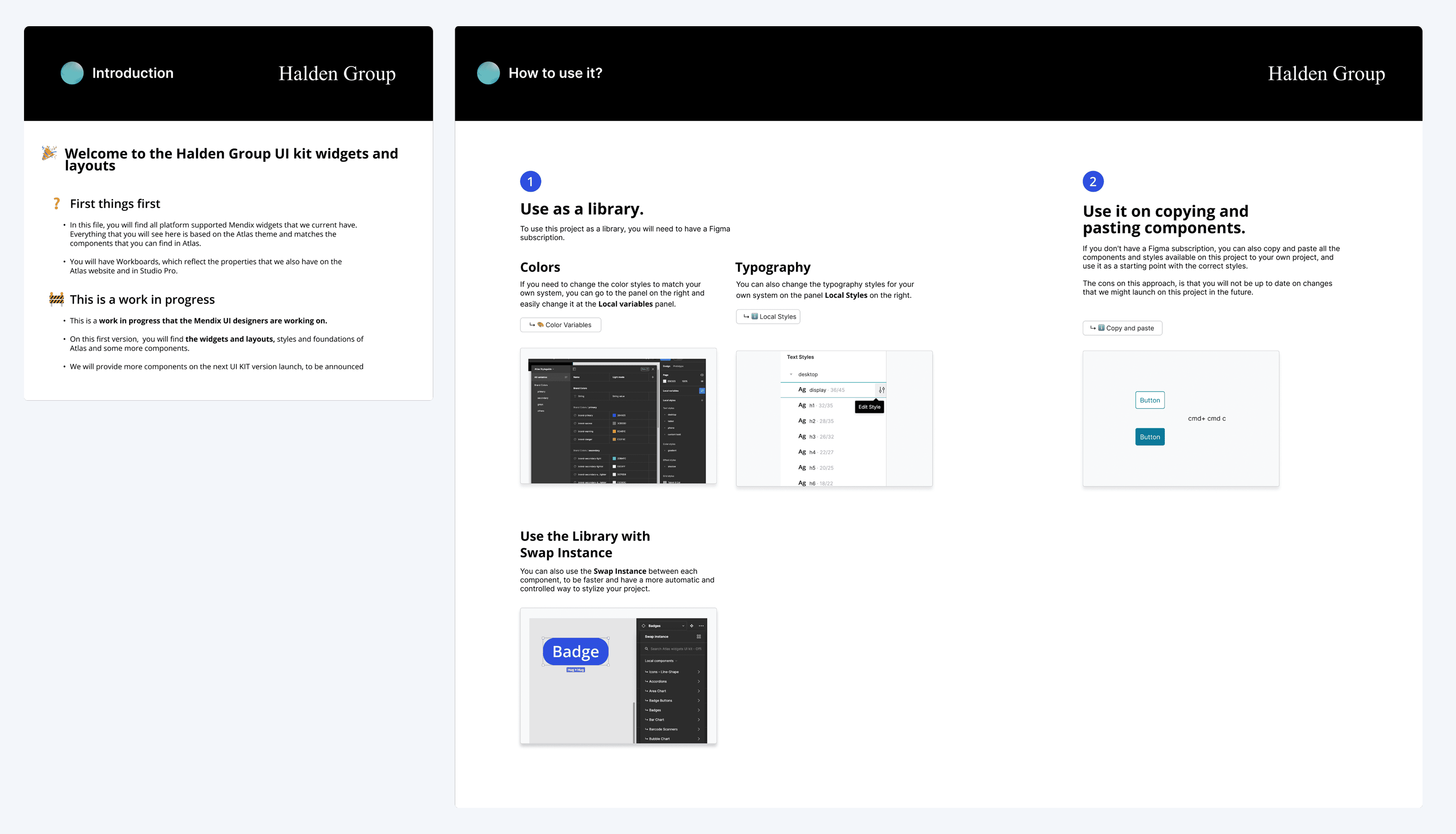
Every component ships with a Getting Started reference so designers and developers can adopt the system without needing me in the loop. The system scales because it explains itself.
Frictionless adoption
New team members can find what they need, when they need it — reducing time-to-first-contribution and preventing the design system from becoming a bottleneck.
Getting Started documentation page explaining how to adopt and use the design system.
Key Decisions
Extending Mendix rather than replacing it
The system refines the existing Mendix visual language instead of overwriting it. Developers already familiar with the platform adopt the new components without friction, and teams mid-project can adopt incrementally rather than migrating everything at once.
Multi-breakpoint from day one
Users work primarily on desktop — enterprise data is dense and needs the real estate — but I built desktop, tablet and mobile variants into every foundational token from v1. Retrofitting responsive behaviour into a mature system is painful; building it in upfront saved every downstream product significant effort.
Balancing information and simplicity
When a project needs a new component, we discuss whether it belongs in the shared system or should stay project-specific. This governance model keeps quality high and prevents 'one-off' components from bloating the library.
Naming and versioning the system
The design system is called Meridian and ships under semantic versioning. Naming created a shared vocabulary — teams say "check Meridian" instead of "the Figma library" — and versioning signals that the system is a maintained artifact, not a one-off deliverable. Currently at v0.9.9, with v1.0 planned as coverage stabilises.
Outcome
The system is currently in production across four internal Mendix products, plus two additional projects outside Mendix (including OpenText integration and the company's internal learning platform). Impact reported by my manager after several months of adoption: design time per project dropped from ~2 months to 3–4 weeks (excluding client-driven changes and post-testing iterations); development time dropped from 3–4 months to 1–2 months per project. Three products have shipped since the start of 2025, with continuous improvements based on client feedback and new requirements. What travels forward: the biggest lesson from building this alone is that a design system's real value isn't in its component library — it's in the conversations it removes. When every designer starts from the same foundations, arguments about "should this be blue or teal" stop happening, and everyone gets more time on the actual problems.

By treating consistency as a shared decision instead of a policing exercise, the system became something teams pull from because it helps them ship — not because they're required to.
Layout grids showing responsive breakpoint configurations for desktop, tablet and mobile.Layout grids showing responsive breakpoint configurations for desktop, tablet and mobile.Layout grids showing responsive breakpoint configurations for desktop, tablet and mobile.
⚠
DISCLAIMER

This case study is shared for portfolio purposes under confidentiality. The company name, product names, team member names and internal department references have been changed to protect client identity. Screenshots and materials are illustrative of the design work performed; underlying business data has been replaced with placeholder content. Happy to discuss the full project scope in interviews.