Product Design Portfolio
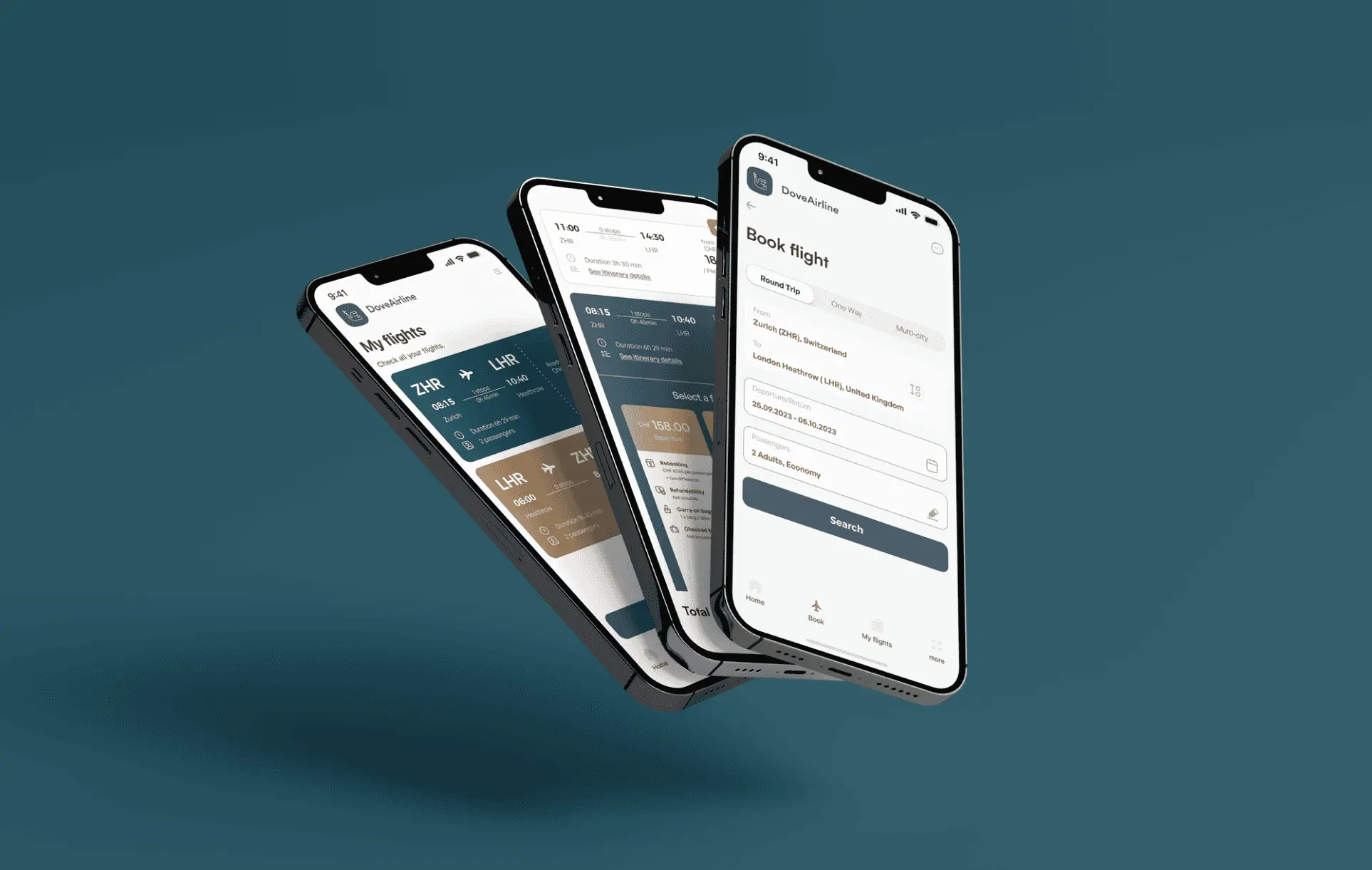
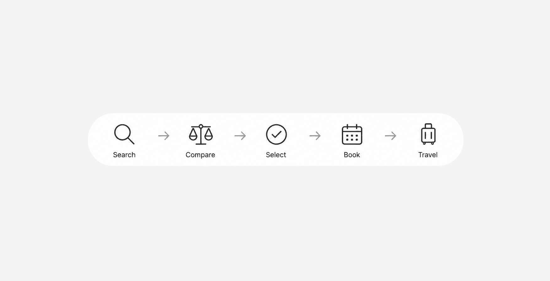
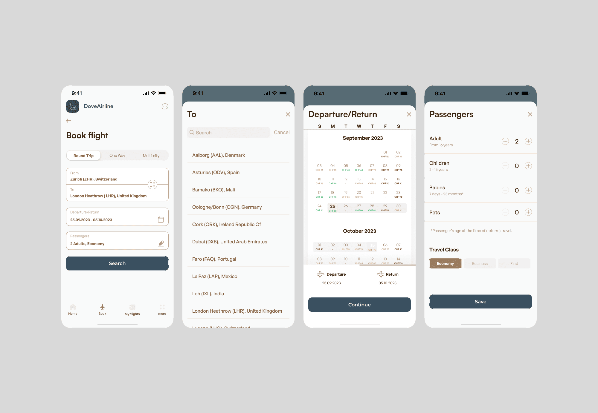
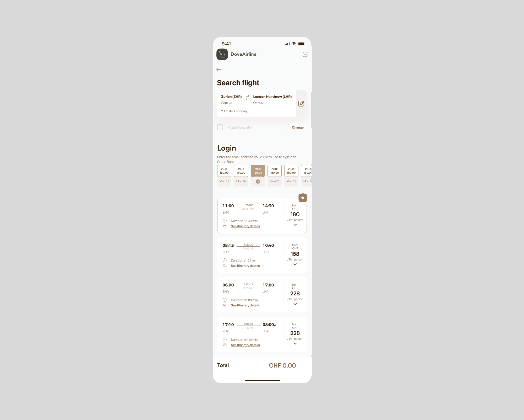
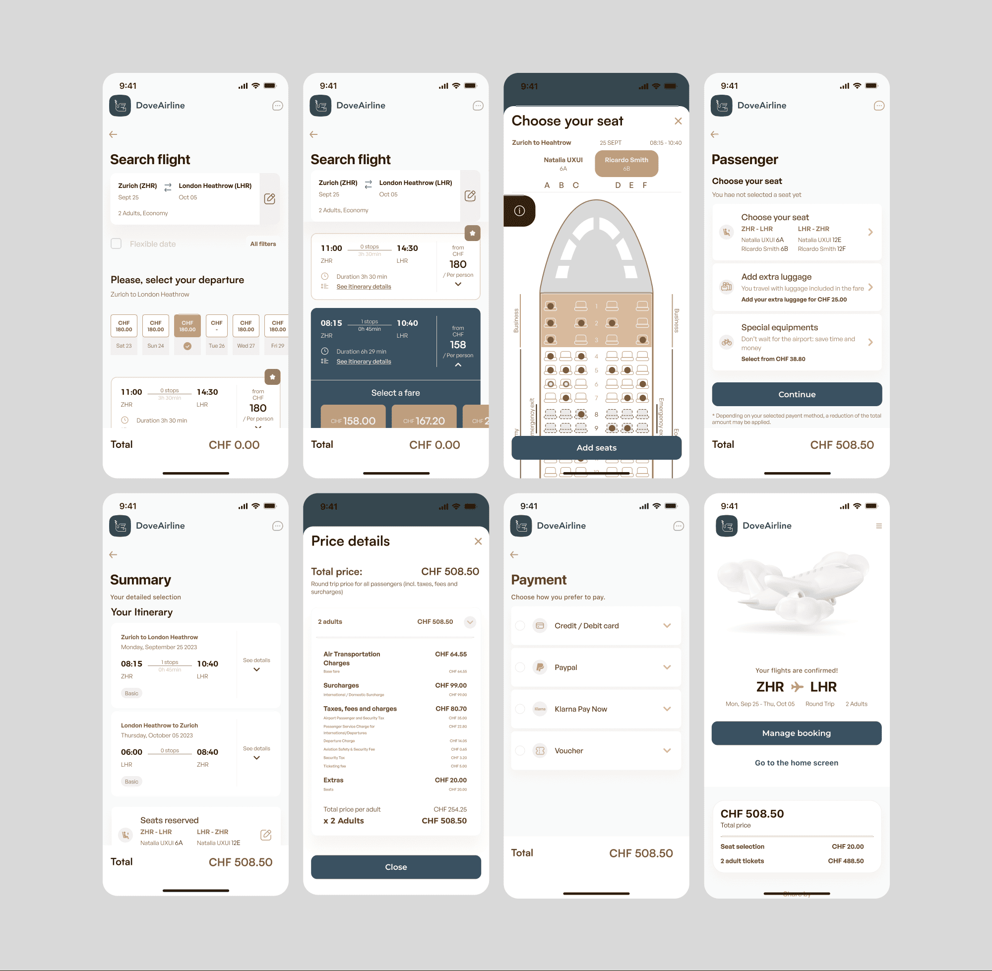
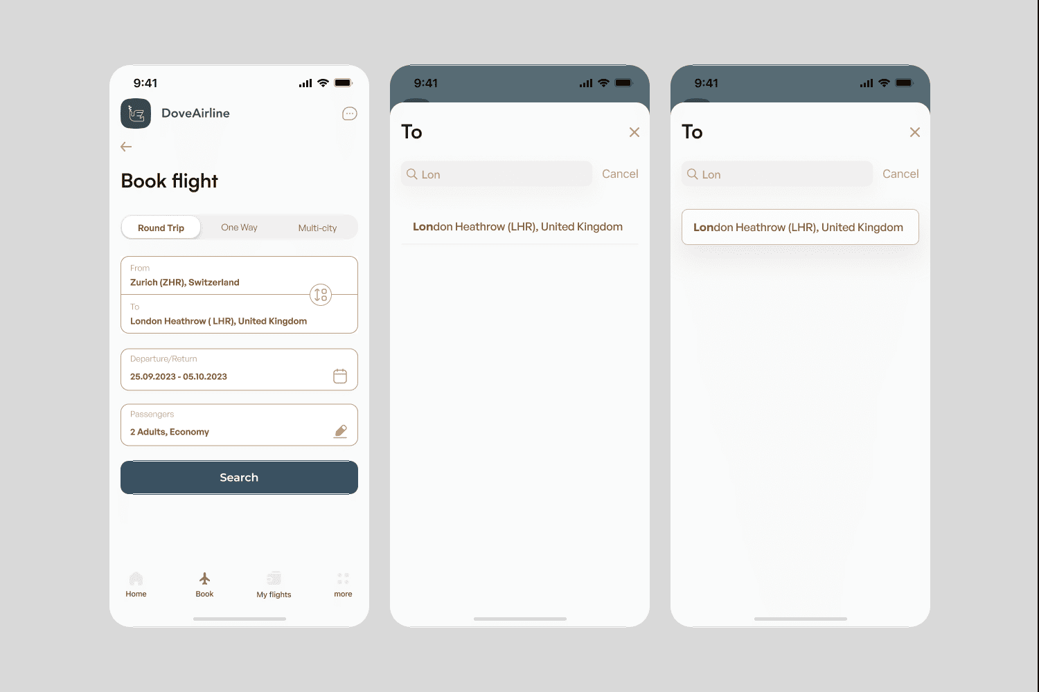
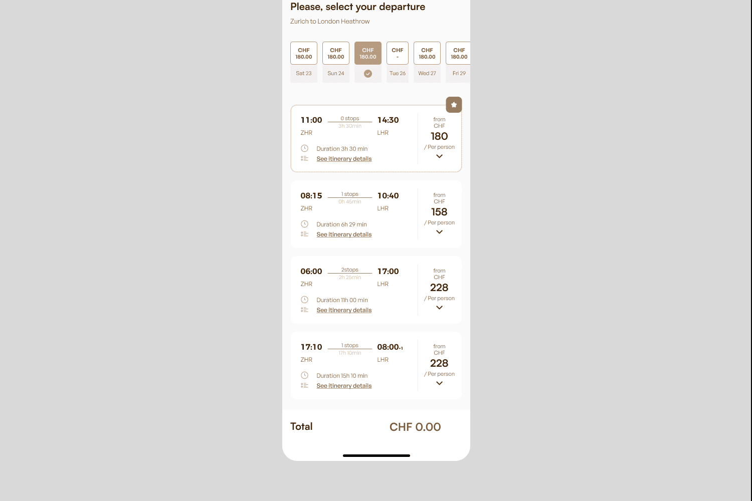
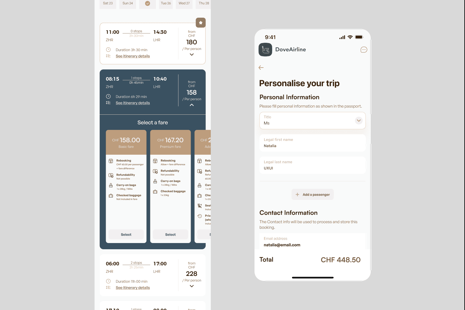
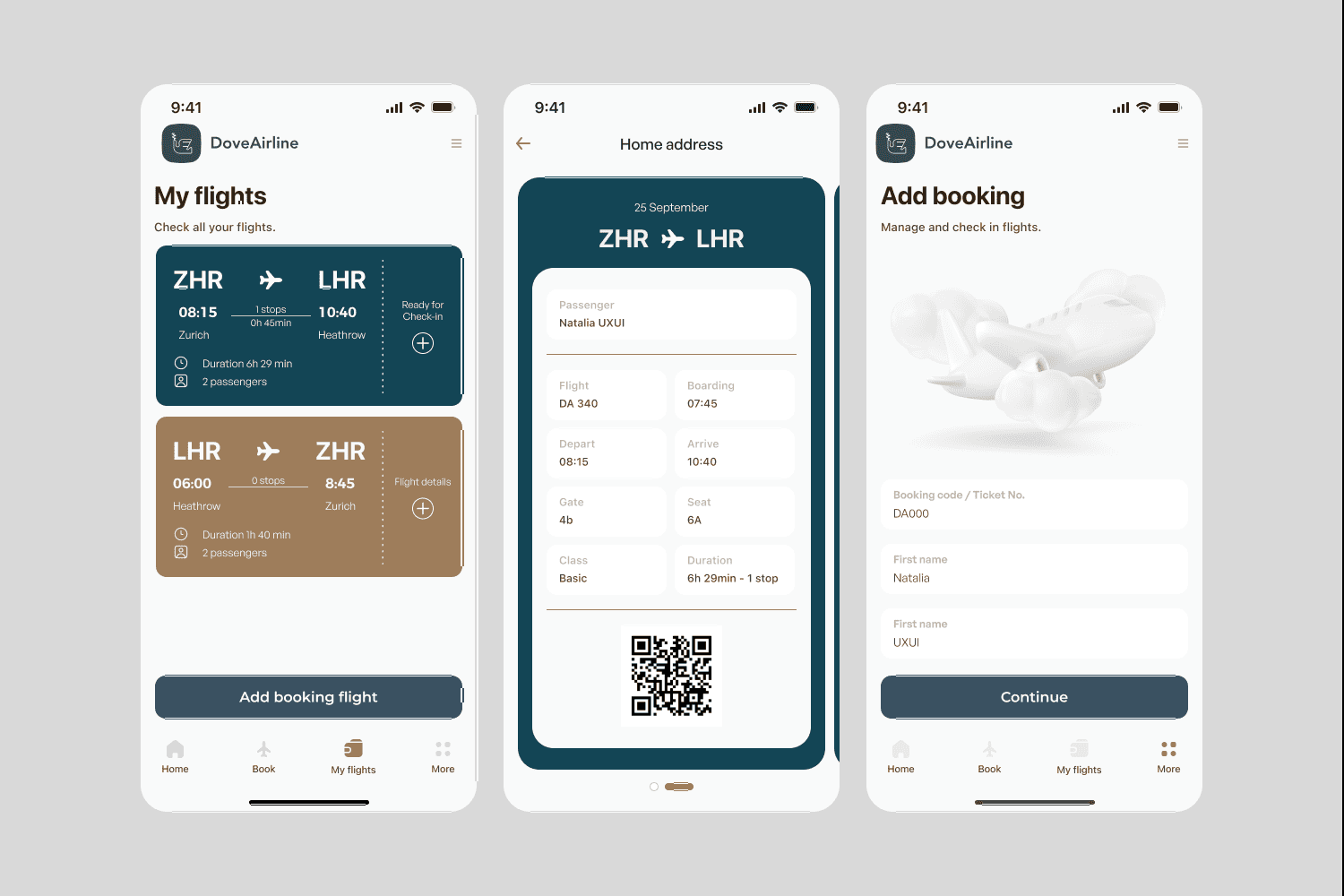
Dove Airline is a flight booking concept designed to simplify travel planning through intuitive search, transparent booking flows and a seamless mobile-first experience for modern travellers.
Role
UX/UI Designer
Timeline
7 mos.
Services
Research, UX Design, UI Design, Prototyping
Year
2024
Industry
Travel
View
View Prototype