Project overview
One platform. Two connected experiences
Nuwwfit is a self-initiated product exploring how nutritionists and personal trainers could manage clients, plans, progress and communication from one connected platform.
The product is designed around two interdependent experiences: professionals need efficient tools to manage and support multiple clients, while clients need a simple and motivating way to understand what to do, track progress and stay connected with their coach.
Rather than treating nutrition, training and behavioural change as separate experiences, Nuwwfit brings them together within a flexible product ecosystem.
Nuwwfit is a self-initiated product exploring how nutritionists and personal trainers could manage clients, plans, progress and communication from one connected platform.
The product is designed around two interdependent experiences: professionals need efficient tools to manage and support multiple clients, while clients need a simple and motivating way to understand what to do, track progress and stay connected with their coach.
Rather than treating nutrition, training and behavioural change as separate experiences, Nuwwfit brings them together within a flexible product ecosystem.
The Opportunity
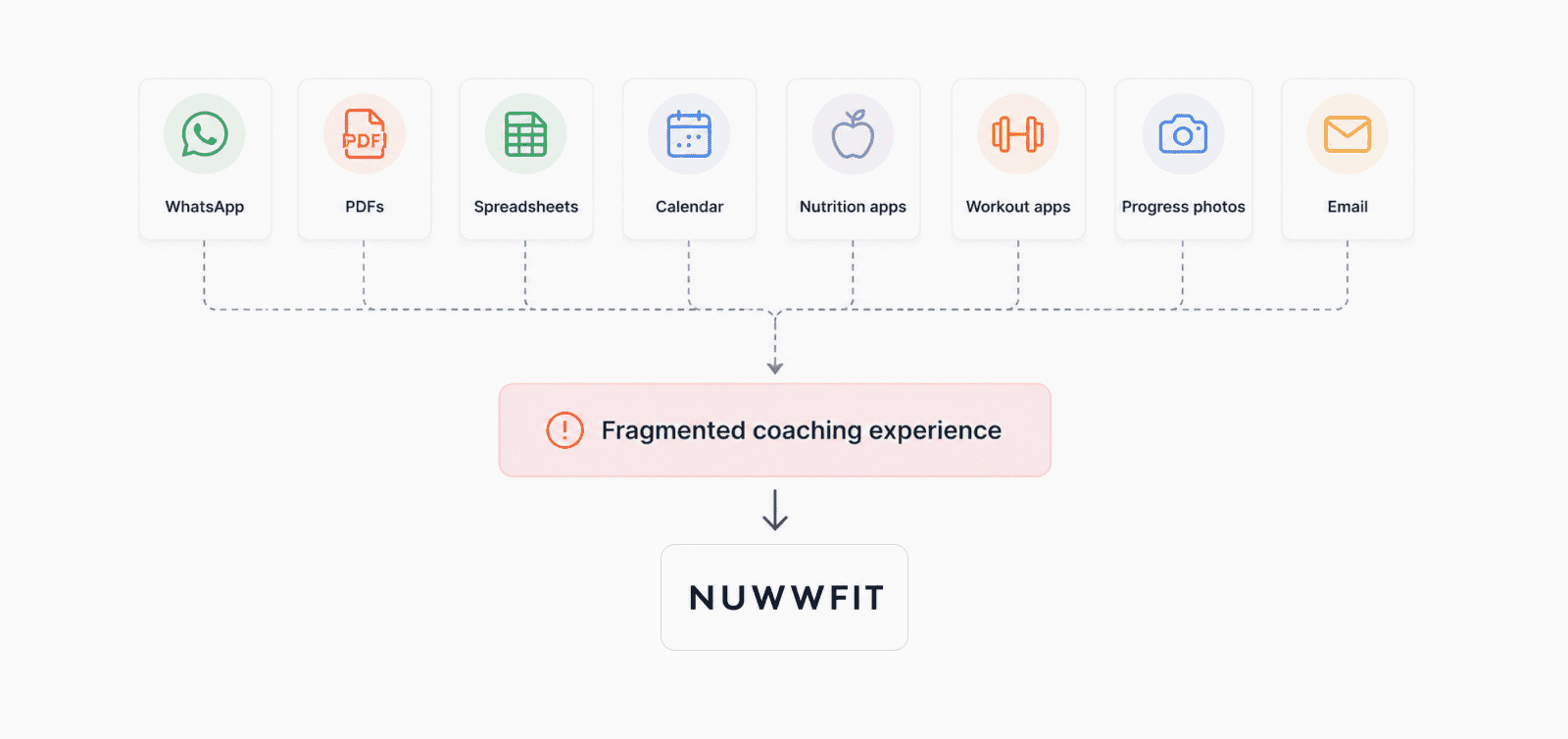
Nutritionists and personal trainers frequently rely on a combination of messaging apps, PDFs, spreadsheets, calendars and specialised tracking tools to manage a single client relationship.
This fragmentation creates additional administrative work for professionals and an inconsistent experience for clients, who may need to switch between different platforms to access plans, log progress, ask questions or understand what to do next.
Nuwwfit started from a simple question:
How might we create a connected coaching experience without turning it into another complex all-in-one platform?
This fragmentation creates additional administrative work for professionals and an inconsistent experience for clients, who may need to switch between different platforms to access plans, log progress, ask questions or understand what to do next.
Nuwwfit started from a simple question:
How might we create a connected coaching experience without turning it into another complex all-in-one platform?
Research Approach
Because the experience depends on continuous interaction between professionals and clients, the research considered both perspectives rather than treating them as independent users.
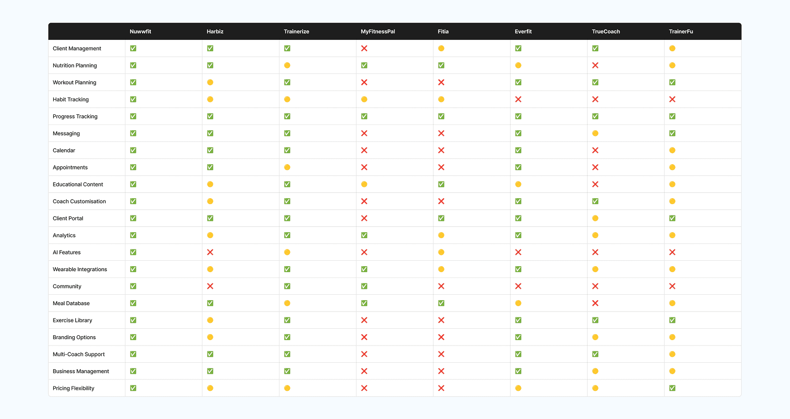
I started with a competitive review of coaching platforms, led by Harbiz, the tool both coaches I interviewed use every day. I then ran six semi-structured interviews: four with clients who had hired a coach or nutritionist, and two with professionals, a nutritionist-trainer and a personal trainer. The same problems came up on both sides: coaches copying data from Harbiz into Excel so nothing slips through, messages that never arrive, and clients who quit when they feel their coach is no longer there.
I started with a competitive review of coaching platforms, led by Harbiz, the tool both coaches I interviewed use every day. I then ran six semi-structured interviews: four with clients who had hired a coach or nutritionist, and two with professionals, a nutritionist-trainer and a personal trainer. The same problems came up on both sides: coaches copying data from Harbiz into Excel so nothing slips through, messages that never arrive, and clients who quit when they feel their coach is no longer there.
- Competitive Analysis
- User Interviews (4 clients, 2 coaches)
- Affinity Mapping
- Journey Mapping
- Feature Prioritisation
- User Interviews (4 clients, 2 coaches)
- Affinity Mapping
- Journey Mapping
- Feature Prioritisation
Research & Insights
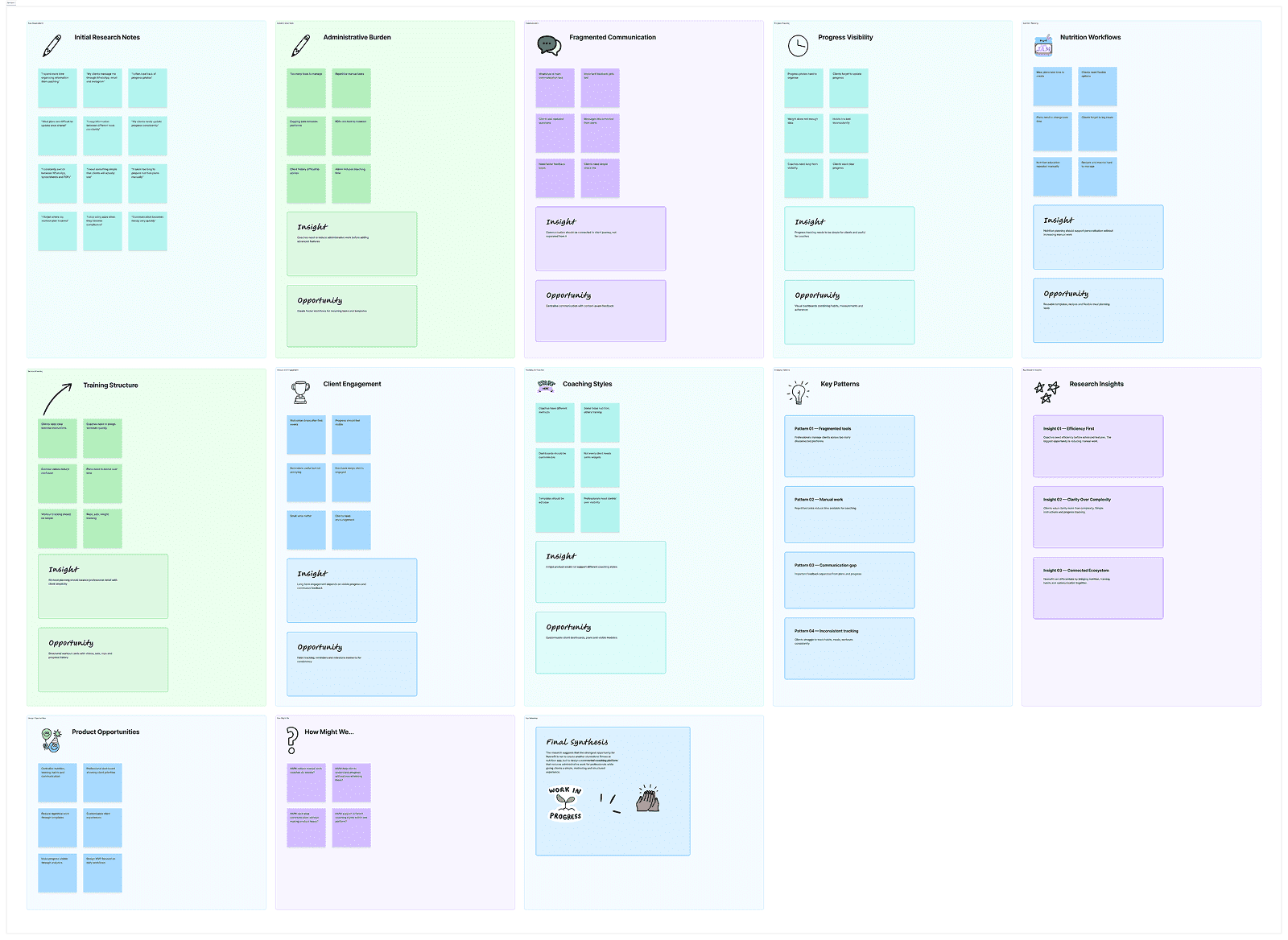
Individual frustrations rarely existed in isolation. The synthesis process revealed recurring patterns around administrative work, fragmented communication, inconsistent progress tracking, motivation and the need for flexible coaching workflows.
Grouping these observations helped distinguish isolated feature requests from broader product opportunities.
FigJam - Affinity Map →Grouping these observations helped distinguish isolated feature requests from broader product opportunities.
Fragmented workflows
Professionals frequently move between multiple tools to manage the same client relationship.
Administrative overhead
Manual updates and repeated tasks reduce the time available for actual coaching.
Progress lacks context
Clients and professionals need more than isolated metrics to understand meaningful change.
Flexibility matters
Different professionals use different methods, making rigid workflows difficult to scale.
Journey Mapping
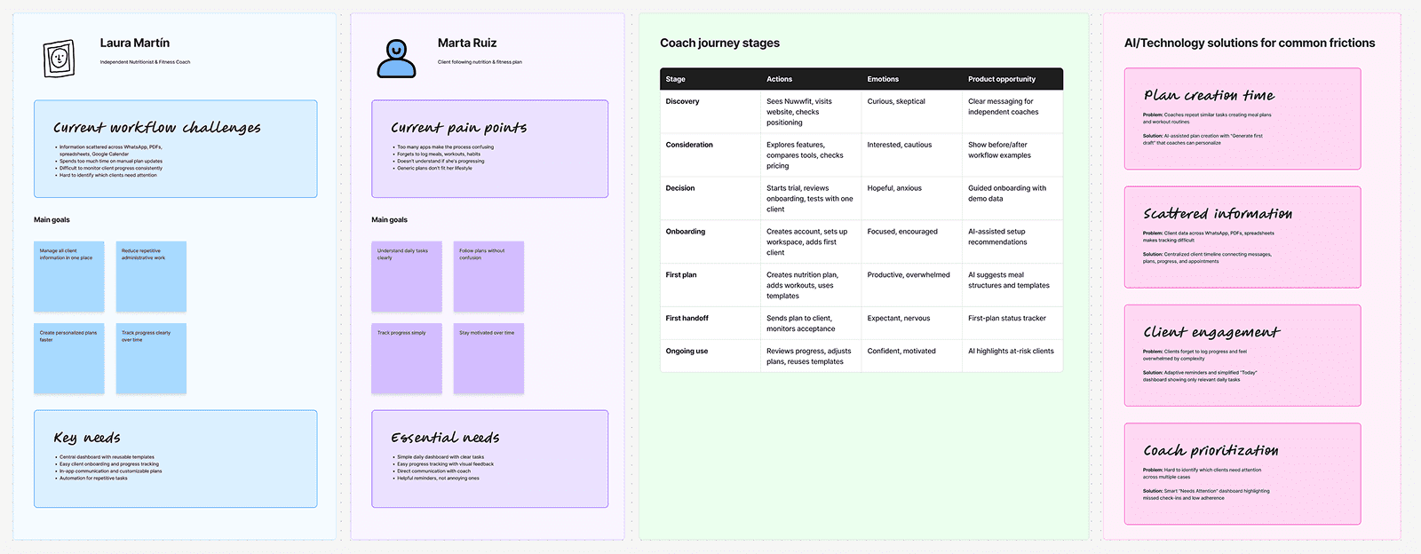
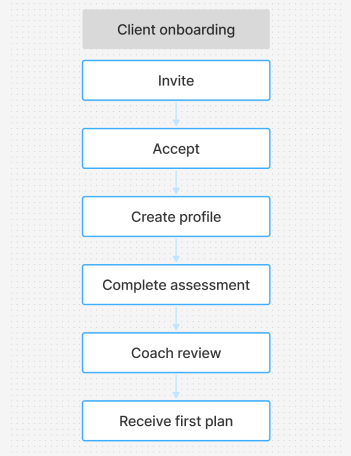
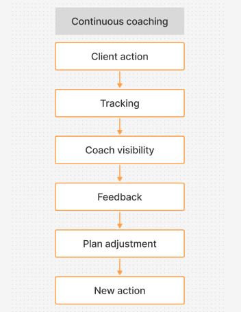
The coaching experience is continuous and interdependent. A plan created by the professional becomes an action for the client. Client behaviour becomes progress data. That data informs feedback, adjustments and future decisions.
Mapping both journeys together helped identify the moments where Nuwwfit could reduce friction and strengthen the feedback loop between professionals and clients.
FigJam - Journey Mapping →Mapping both journeys together helped identify the moments where Nuwwfit could reduce friction and strengthen the feedback loop between professionals and clients.
Moments That Matter
Onboarding
The first experience needs to collect enough information without overwhelming the client.
First plan delivery
A structured plan only creates value when the client understands what to do next.
Feedback loop
Clients need visibility that their coach is present and paying attention.
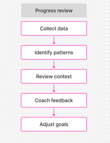
Progress review
Progress should communicate behavioural change, not only weight fluctuations.
Key Insights
What the research changed
01 — Coaches need efficiency before advanced features
The strongest opportunity was not adding more functionality, but reducing repetitive work across recurring coaching tasks.
Product implication: Prioritise templates, quick actions and clear client status visibility.
02 — Clients value clarity over control
Clients do not necessarily need access to every metric or configuration available to professionals.
Product implication: Create role-specific experiences instead of mirroring the professional dashboard.
03 — Communication needs context
Messages lose value when separated from plans, progress and recent activity.
Product implication: Connect communication to the wider client relationship.
04 — Progress should extend beyond weight
Long-term change includes habits, consistency, measurements, training and subjective wellbeing.
Product implication: Design progress as a multidimensional experience.
05 — Flexibility is essential, but complexity is dangerous
Professionals need different workflows, yet unlimited configuration could make the product difficult to use.
Product implication: Build configurable foundations without exposing unnecessary complexity by default.
Product Strategy
The research suggested a broad range of possible features. The challenge was therefore not generating more ideas, but defining what Nuwwfit should prioritise and what it should intentionally leave for later.
The product strategy focused on creating a connected foundation for the recurring workflows shared by professionals and clients.
The product strategy focused on creating a connected foundation for the recurring workflows shared by professionals and clients.
MVP Definition & Prioritisation
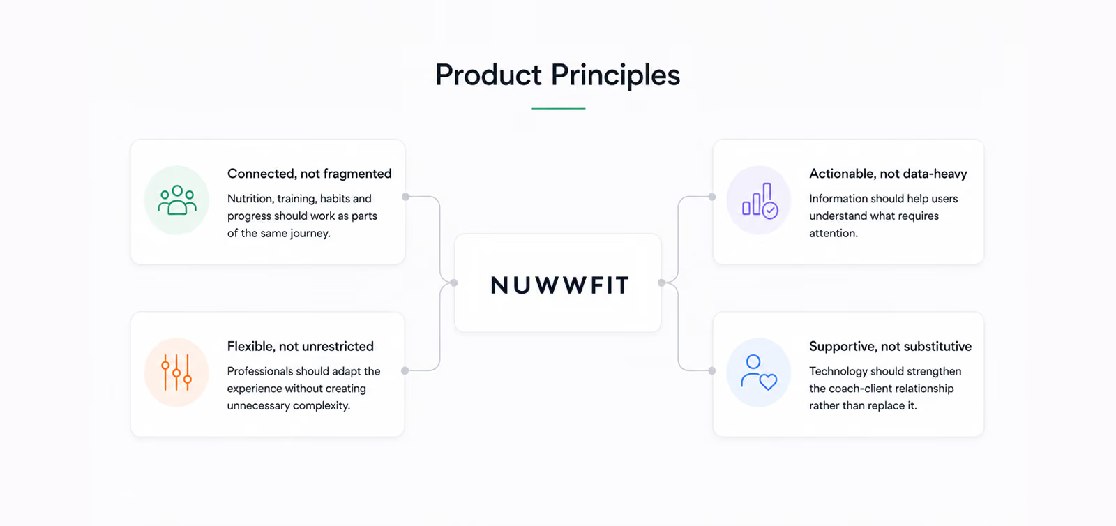
The initial concept quickly expanded into a large ecosystem. To avoid designing an unrealistic first release, features were prioritised around the minimum set of capabilities required to support the recurring coaching relationship.
FigJam - Prioritisation →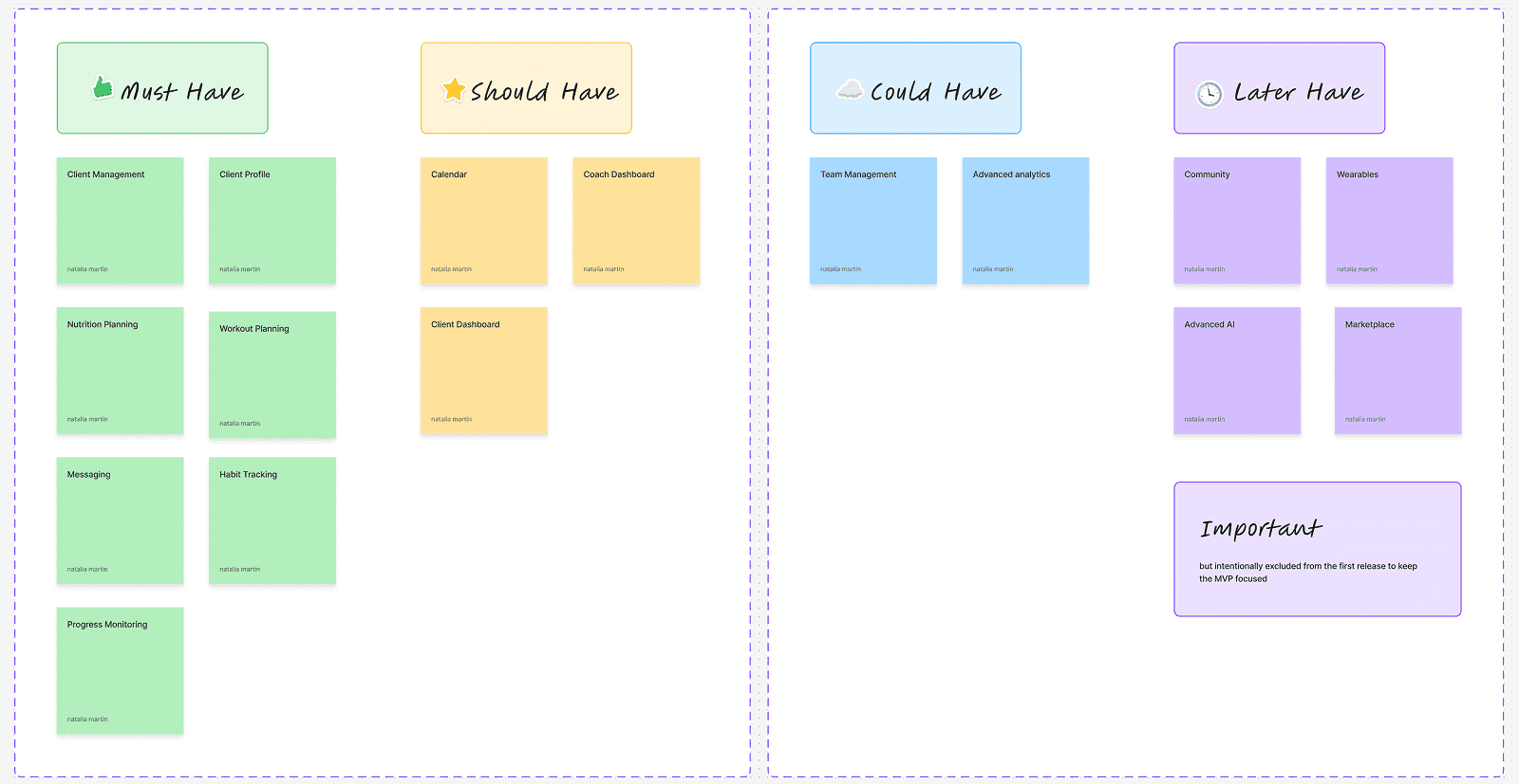
The solution
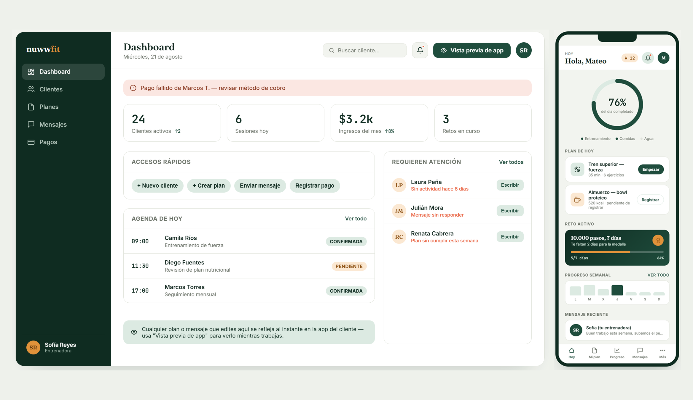
Professionals can manage clients, create plans, review progress and communicate from one workspace, while clients receive a simpler experience focused on daily actions, guidance and long-term progress.
The solution intentionally avoids exposing the same level of complexity to every user. Each experience is structured around what that role needs to understand and do next.
The solution intentionally avoids exposing the same level of complexity to every user. Each experience is structured around what that role needs to understand and do next.
Product Ecosystem
Designing two experiences around one shared system
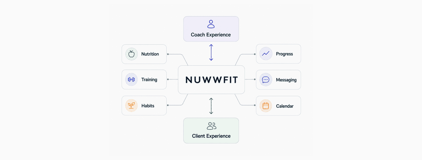
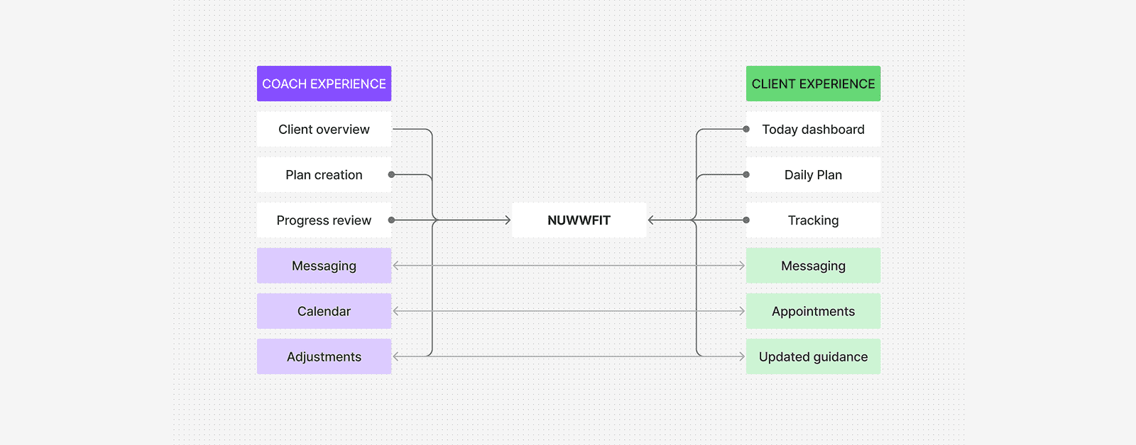
Nuwwfit is not a single interface replicated across different roles. Professionals and clients interact with the same underlying coaching relationship from different perspectives.
The product architecture therefore separates role-specific needs while preserving shared information and continuous feedback.
Nuwwfit is not a single interface replicated across different roles. Professionals and clients interact with the same underlying coaching relationship from different perspectives.
The product architecture therefore separates role-specific needs while preserving shared information and continuous feedback.
Information Architecture
Creating structure before adding screens
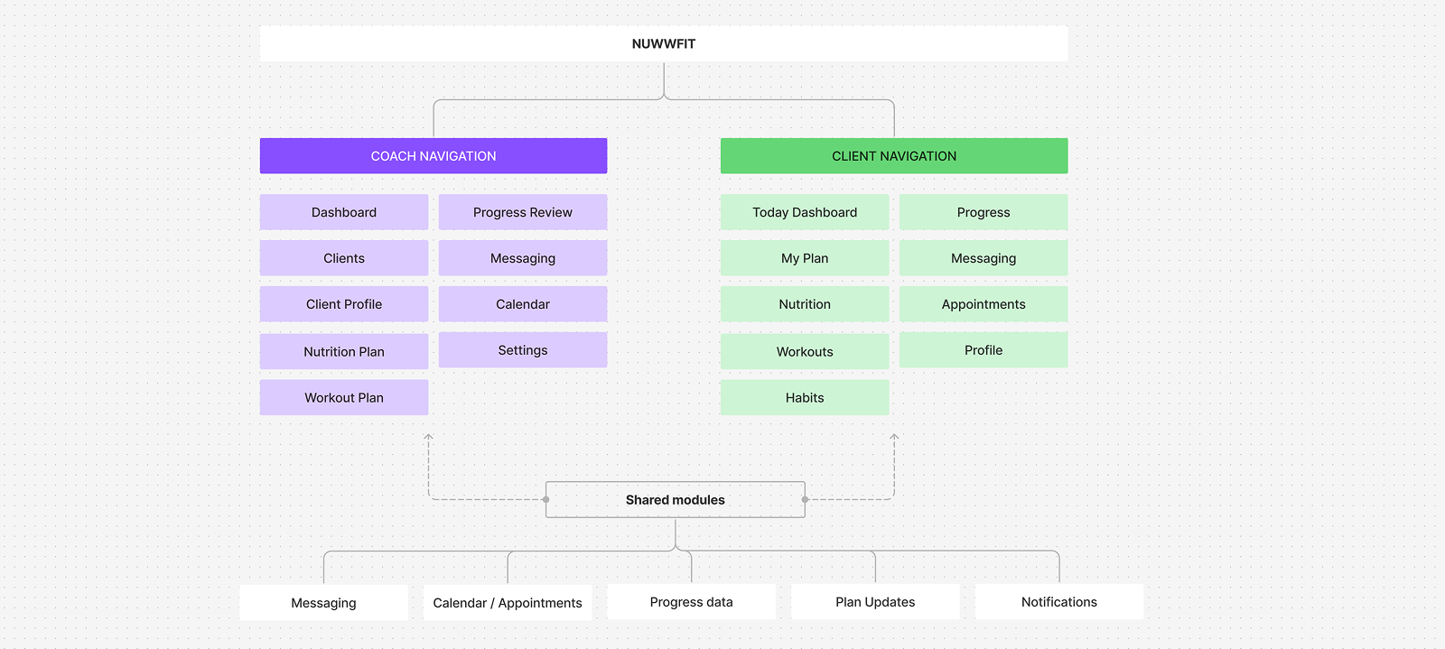
As the product expanded, information architecture became essential to prevent the experience from becoming a collection of disconnected features.
Navigation and content hierarchy were structured around recurring tasks rather than individual feature categories alone.
As the product expanded, information architecture became essential to prevent the experience from becoming a collection of disconnected features.
Navigation and content hierarchy were structured around recurring tasks rather than individual feature categories alone.
Core User Flows
Flow 1 — Client onboarding
Flow 2 — Continuous coaching
Flow 3 — Progress review
Design System
Because Nuwwfit includes multiple roles, workflows and data-heavy experiences, a reusable design system was established early to support consistency and faster iteration.
The system includes foundational tokens, typography, responsive layouts, reusable interaction patterns and modular components designed to evolve alongside the product.
Rather than styling each screen individually, components were built once and reused across both the Coach and Client experiences — ensuring that a card, a status badge or a button behaves and looks the same everywhere it appears.
The system includes foundational tokens, typography, responsive layouts, reusable interaction patterns and modular components designed to evolve alongside the product.
Rather than styling each screen individually, components were built once and reused across both the Coach and Client experiences — ensuring that a card, a status badge or a button behaves and looks the same everywhere it appears.
Foundations
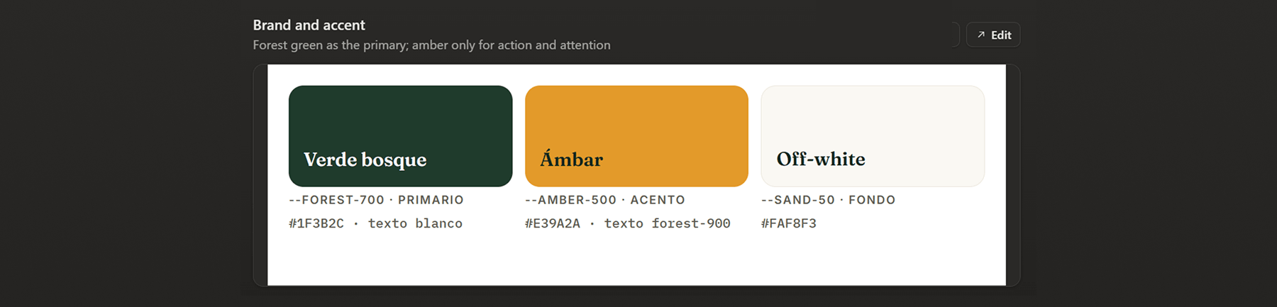
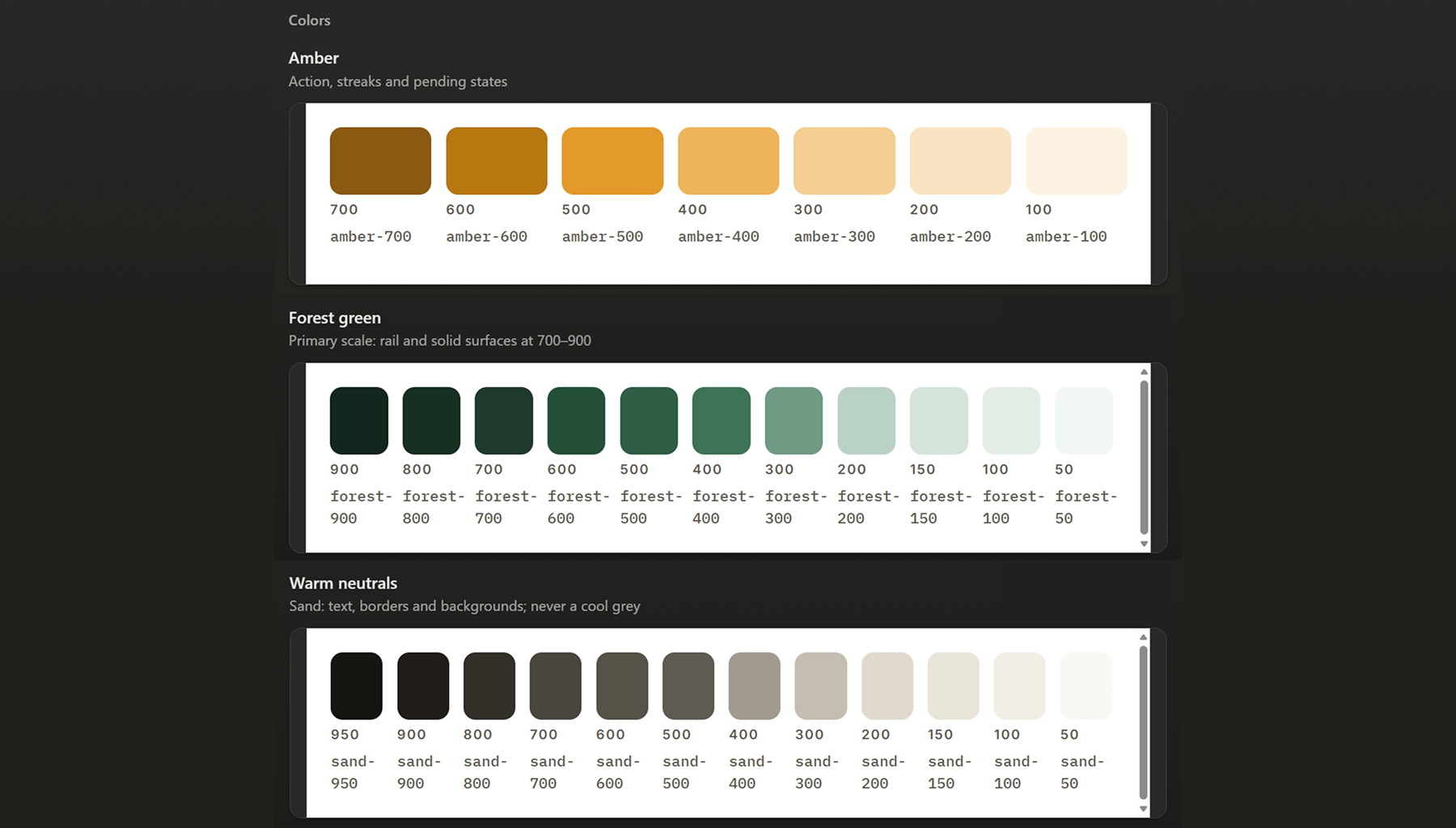
Colour is built on three scales — a primary forest green (50–900) for structure and brand presence, a warm sand neutral used for text and surfaces instead of cold grey, and an amber accent reserved specifically for action, streaks and pending states. On top of these, a small semantic layer (confirmed, pending, alert, info) keeps meaning consistent across the product, independent of where a colour happens to be used.

Components
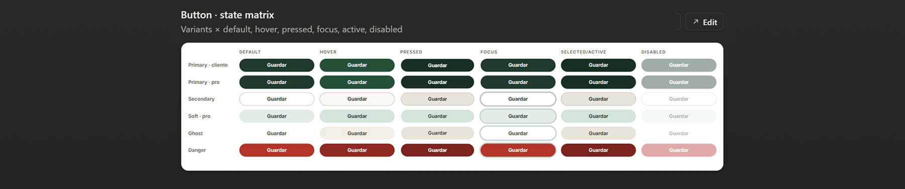
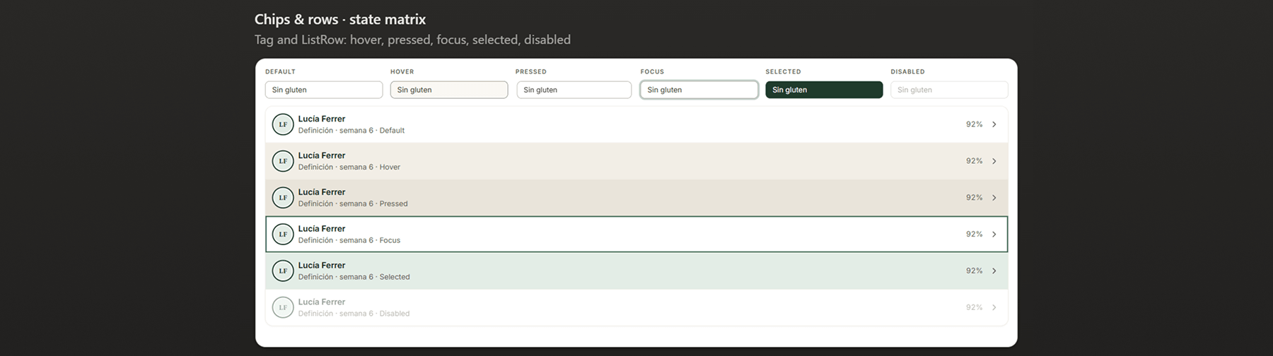
Every core control — buttons, chips, list rows — was defined across its full state matrix (default, hover, pressed, focus, selected, disabled) before being used anywhere in the product. This state-first approach catches inconsistencies early and means new screens can be assembled from existing, already-validated components rather than one-off styles.
Navigation
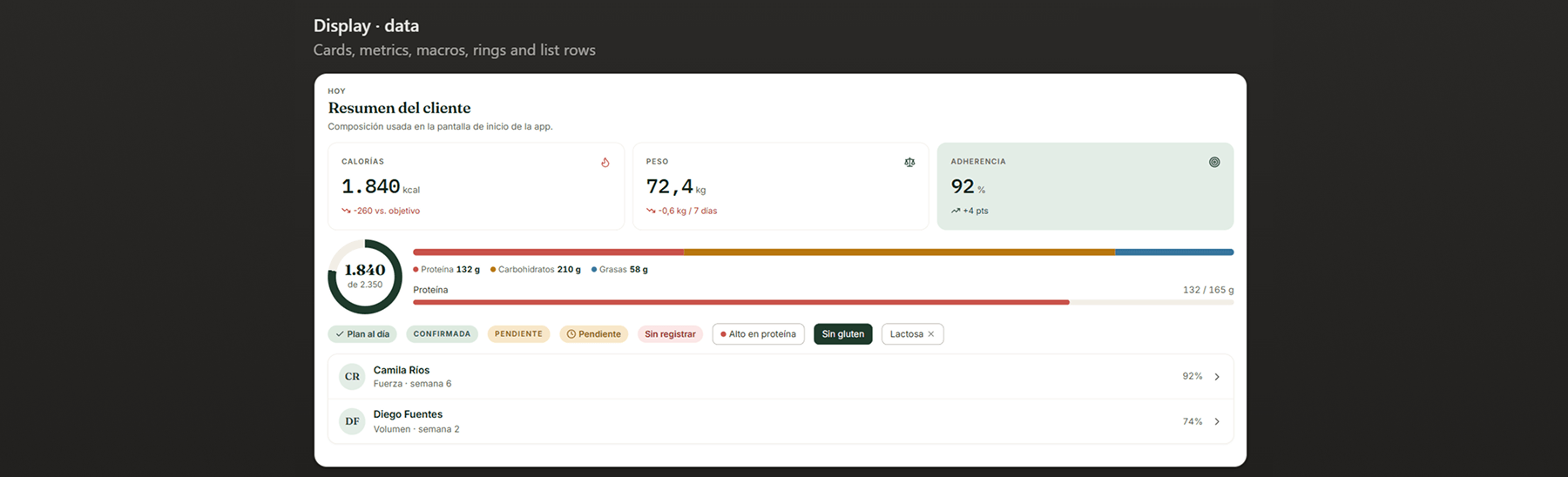
Shared navigation patterns — a persistent rail for the Coach experience, a bottom tab bar for the Client app — keep both roles feeling like one connected product rather than two separate apps. Data-heavy components, like the client summary card with macros and adherence tracking, follow the same visual language: clear hierarchy, sparing use of colour, and one primary number per metric.

Typography
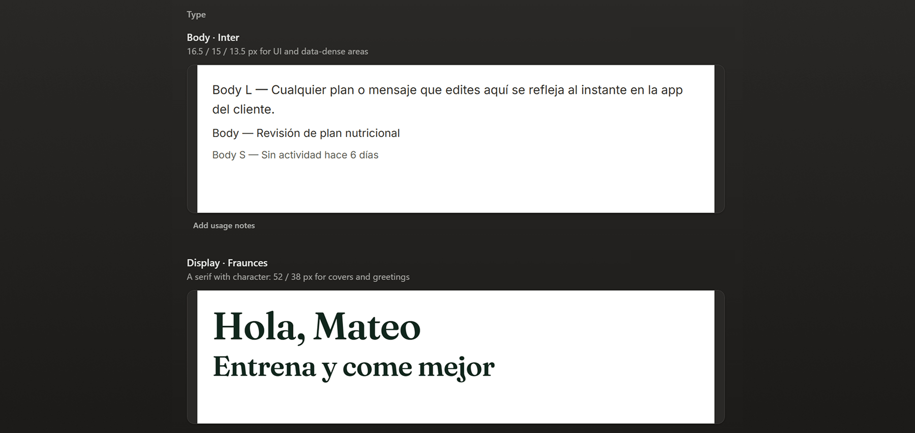
Type pairs two families with distinct jobs. Inter carries UI text and data-dense areas — client lists, activity logs, plan details — at three body sizes (16.5 / 15 / 13.5px) sized for legibility without competing with the content itself. Fraunces, a serif with character, is reserved for display moments that should feel warm rather than functional: greetings, covers, the first thing a client sees when they open the app.